Now in its sixth year, the Brand New Conference has become our outlet for graphic designing since we don’t take on much, if any, client work, so it’s always a treat for us to design for designers and to figure out ways to try to meet the standards that we regularly critique in this website. At the very least, our goal is to not suck. Here are the identity and materials we designed and produced for the 2015 Brand New Conference in New York, NY, on September 24 – 25. After the section with the animated GIFs there is a video showing the arduous process we went through to get the main materials done so be sure to not miss that as the plot of this identity hinges on it.
There is a Flickr album with the full set of sexy photos of the materials and another with all the photos from the event.
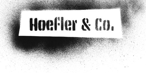
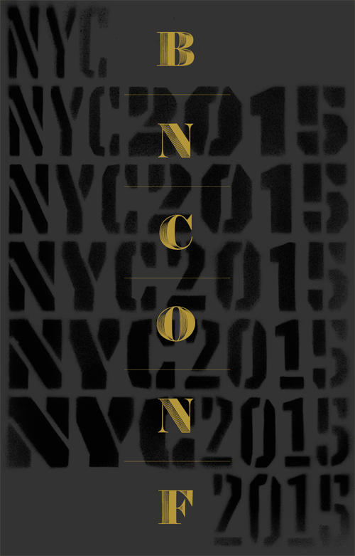
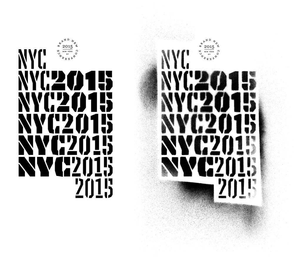
"Logo"
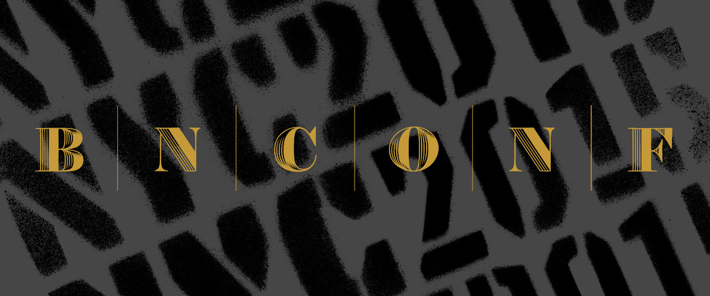
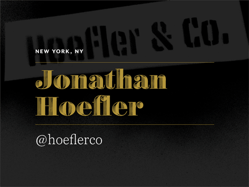
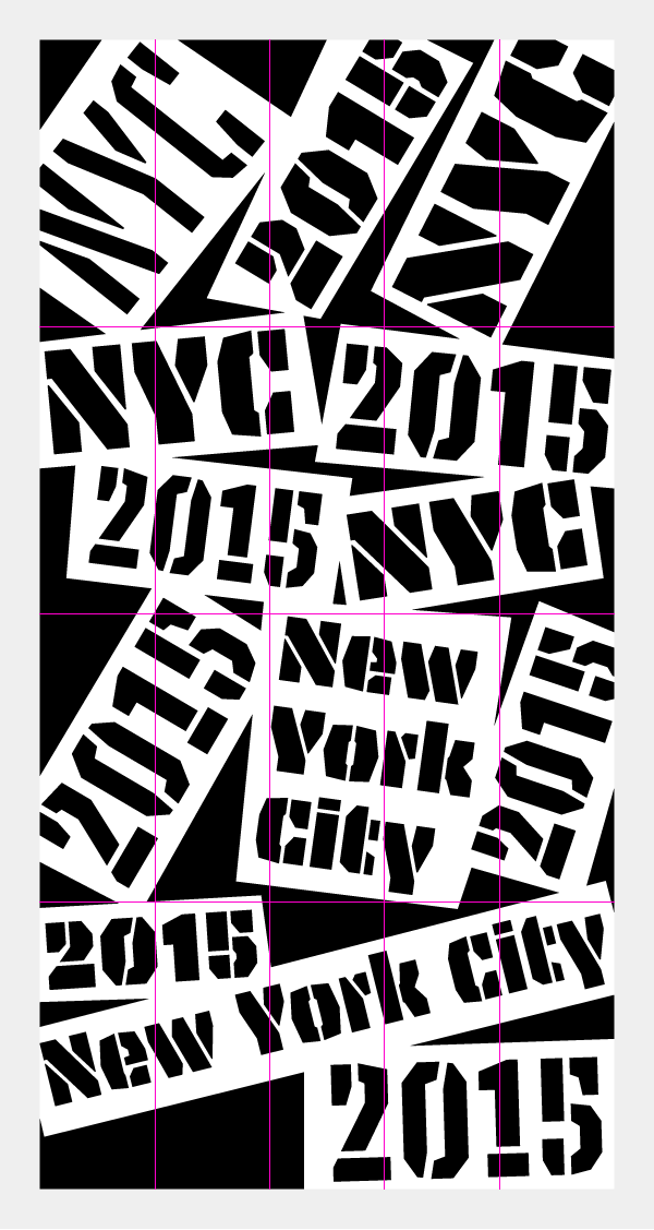
I would love to say that we had a killer concept from the start that originated from deep brainstorming sessions but we don’t roll like that. Bryony saw Underware’s Tripper Pro and liked it for its ugliness and suggested as something for the conference. I first dismissed it, because stencil fonts can feel trendy and an easy way out to come across as edgy. But then we associated it with New York and its gritty, 1970s – 1980s, graffiti-defaced subways and then we wondered what’s the point of using a stencil font if you are not going to use it as a stencil? So Tripper Pro, spray-painted to the extreme, was our first identity element. From there, we chose something on the complete opposite end of the spectrum that would hint at the luxurious and sometimes extravagant lifestyle of New York and we went with Hoefler & Co.’s Obsidian, which would always be used in gold.
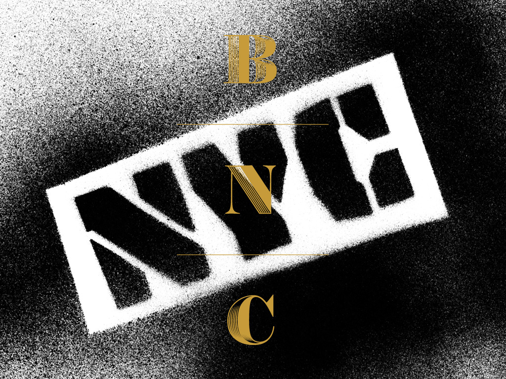
The two main elements of the identity: Grit and Luxury.
I put logo in quotes in the subhead because we didn’t really have a logo-logo. Obsidian sort of stood in as the logo which we used in a vertical stacking and could be written as “BNC” or “BNCONF” but sometimes we also wrote “NYC” in it. The main idea was that the spray-painted Tripper Pro and the gold Obsidian would serve as the main identifying elements.
Color
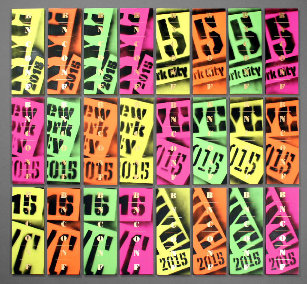
Going back to the nasty, spray-painted days of New York we latched on to a very 1980s-tastic color palette of fluorescent green, yellow, orange, and pink, with gold always on top. The spray painting could be black on white, gray, or the fluorescent backgrounds or it could be fluorescent on white and black backgrounds. For on-screen use we always went with black spray on gray background because we care about your retinas.
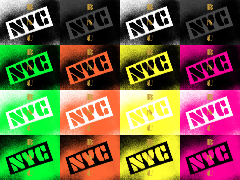
All possible color combinations.
At first we were very concerned about not finding all the different materials and finishes in the 1980s neon colors we wanted but, amazingly, pretty much every product you might want comes in neon colors. Even shoelaces.
Spray-paint Everything
The very first thing we did for the conference’s identity was the names of the companies of each of the speakers. Easy enough. We hand-cut all the stencils, spray-painted a few samples of each, scanned them, cleaned them up in Photoshop, and done. So far so good.
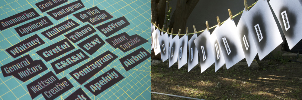
Hand-cut stencils and drying process.
Title cards for the event. Scanned all the tests we did of the company names, aligned them, and GIFed them.
Same treatment for this one; a cropped variation that panned up was used on screen at the conference.
Production
I debated whether to show this video now or at the end of the post but I kept referring to it a lot in the explanations below so here is the making of the program, tote bags, and badges. I think seeing it first helps understand some of the rest of the process that went into it.
Production process. Apologies for the amateurish editing and titling. Movies, generated in iMovie, are not our forte.
Program
The program was the first printed piece we tackled and boy did it get interesting. Our big idea was to spray-paint every cover. We figured 1,000 covers wouldn’t be too difficult. Then Classic, our printer, told us they needed 1,500 covers so that 500 could be used for testing and makeready. Okay, 1,500… we can do that. Then Studio on Fire, who did the foil stamp, asked for 200 extras for them to use as makereadies. So we were up to 1,700 covers we had to spray-paint. After a lot of testing with Classic and Studio on Fire it also came up that the fine lines of Obsidian weren’t going to perform very well foil-stamped so I had to do my best impersonation of Hoefler & Co. and I modified the engraved shadows to have 3 dividers instead of 5. You would think you can just delete 2 of the lines and be done with it. I wish. The result, below, probably doesn’t hold up to close-up scrutiny but for a one-time, foil stamp use it’s pretty darn good.
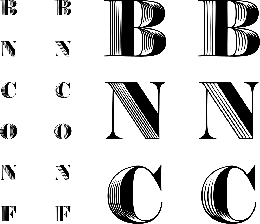
Original five-line engraving Obsidian on the left; modified three-line on the right. In the small rendering you can see what a difference it makes.
Part of the appeal of spray-painting the covers was that we could use multiple paper colors and Neenah’s ASTROBRIGHTS® line was perfect as it had all the bright/neon colors we could ask for. We also realized we needed to set up multiple “stations” for spray painting so we decided that each station would have a different design.
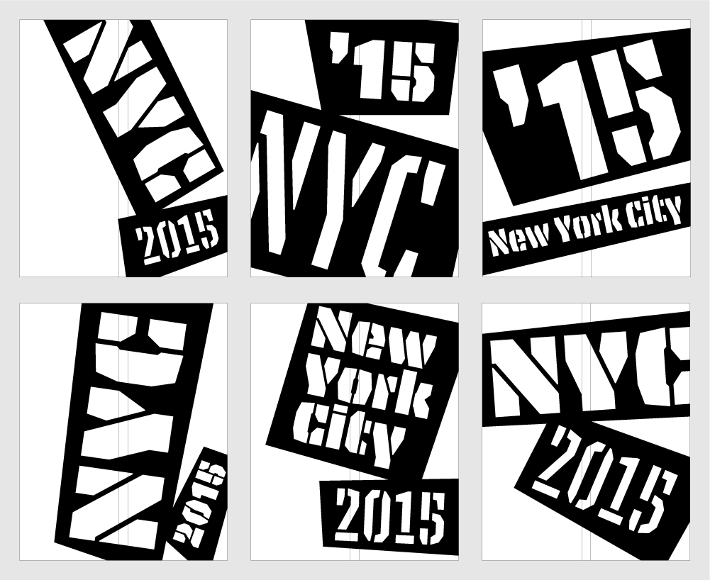
The six different stencils for the covers.
6 designs; 4 color papers; 1,700 completely unique covers.

As pretty as they look color-coded in the image above this one, we also love the more anarchic feel of the colored papers alternating.

And, yes, the edge of the program is gilded because it’s so money. Seriously: there is no concept here, it just looks frickin’ fantastic. Tip of the hat to Classic for making it happen.
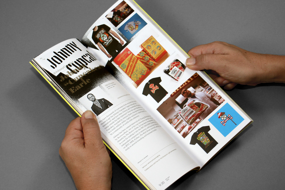
The inside of the program extends the aesthetics of the identity with a little bit of annual report-ness to it. More pictures of the program can be seen on this post on FPO.
Tote Bag
The tote bags presented another problem in that fabric doesn’t hold spray paint very well so we went through seven or eight different bag styles until we landed on a nylon bag offered by another one of our sponsors, CustomInk. Once we found the bag we developed another set of stencils and a slightly different method of spray-painting them.
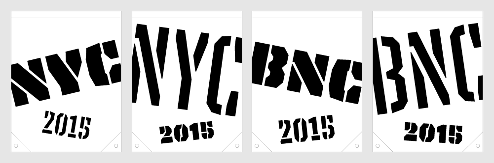
Four different stencils.

4 designs; 4 colors; 1,000 different totes.
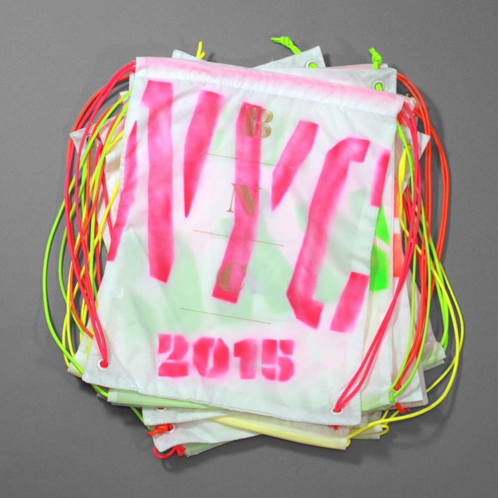
The totes are silkscreened with gold.
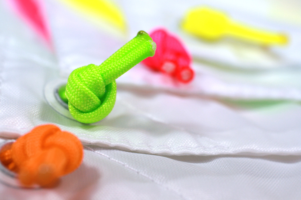
We replaced the original crappy white handles with matching neon paracord.
Badges
For the badges we wanted something hefty and street-ish so we decided to do them on wood, to hint at the wood panels used in scaffolding throughout New York. We bought large planks that we spray-painted a pattern on and then trimmed down to individual badges for which we had to buy a table saw, which made Bryony very happy.
12-by-24-inch stencil and grid for individual badges.

Individual badges. Silkscreened in gold as well. They all look completely different as the pattern is somewhat random. They all have bits and pieces of the Tripper Pro without ever spelling something completely.
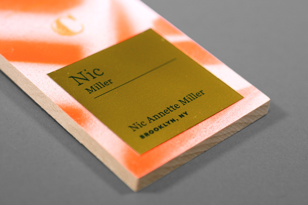
Attendee info was printed on square gold stickers that we placed on each little slab of wood.
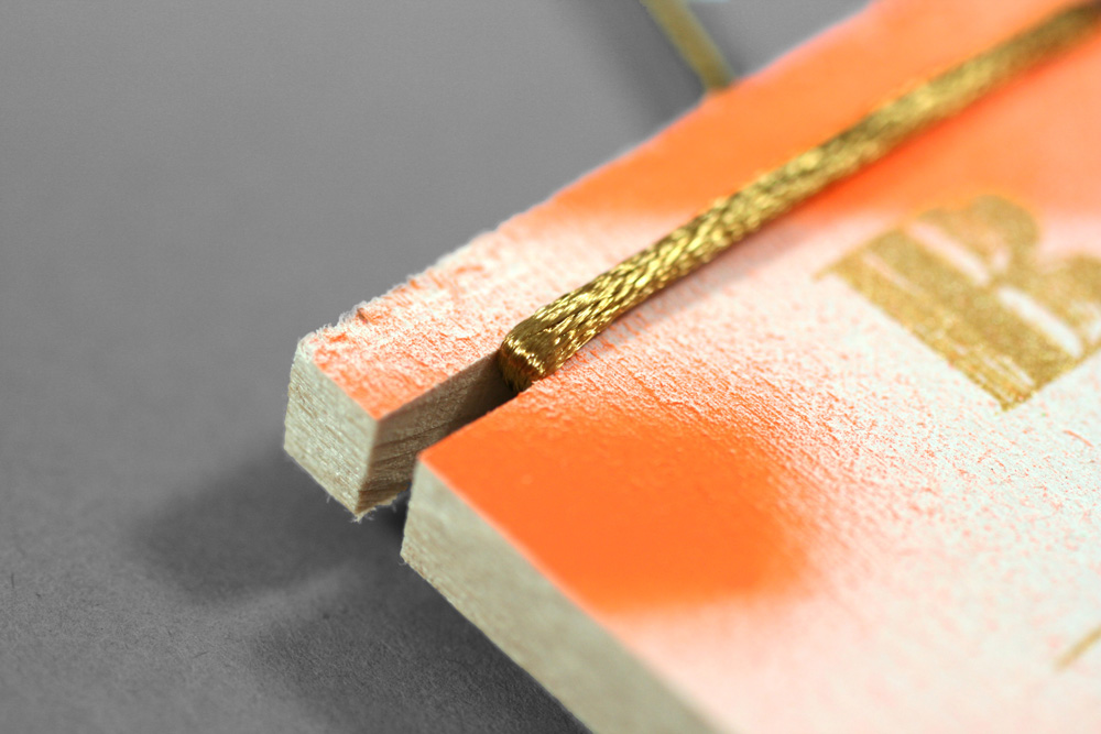
The original idea was to drill round holes on the badge but the wood was either breaking or looking very messy so we had to go with plan D, which was cutting notches on the side and wrapping the gold (of course) ribbon around it. The horizontal line of the ribbon clashed with the layout so that was something we had to come to terms with.
T-shirt
Yes, we thought about spray-painting all the t-shirts but luckily it wasn’t feasible, so we printed them with CustomInk, who agreed to split the run into four neon colors with gold lettering on the back. The concept for the t-shirt was basically “make it cool and designy” so we went with a waterfall type specimen of Tripper Pro specifying the city and year.
Original stencil on the left, spray-painted result on the right.
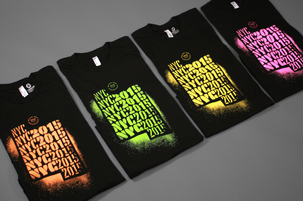
Fluorescent colors on black t-shirts.
Juicy detail of a badge we created whenever there needed to be some kind of seal/description about what something was about.
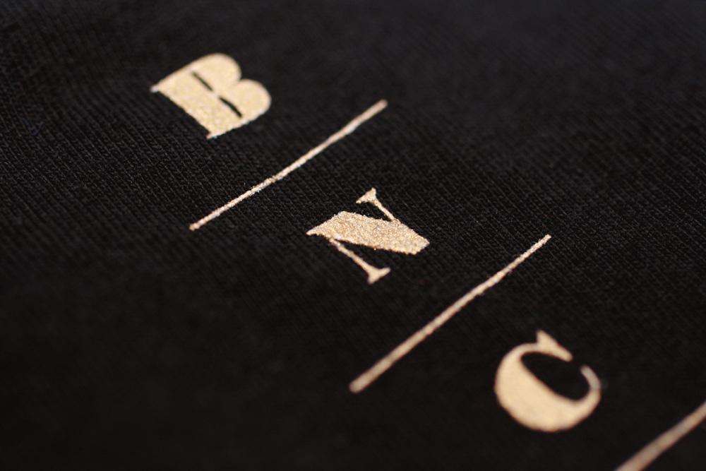
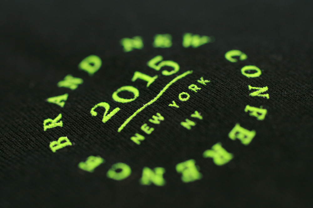
The back of the t-shirt has a small BNCONF Obsidian gold logo.
Podium
Since last year’s conference, wrapping podiums like a present is our new favorite thing. We spray-painted a large, flexible banner that we then wrapped around a crappy podium. We did two color versions and our idea was to change it for the second day but, unfortunately, the banner didn’t survive shipping.

Podium views.
Perhaps as karmic consolation prize, the crew at the venue was able to throw some neon colors at their ceiling structure and it totally made the room.

“Color cloud”.
Other Signage
Once you start spray painting you don’t want to stop. It’s funner and cheaper than printing one-offs. We did some quick and very modest signs to point people from the street to the venue and we went crazy on the tablecloths.
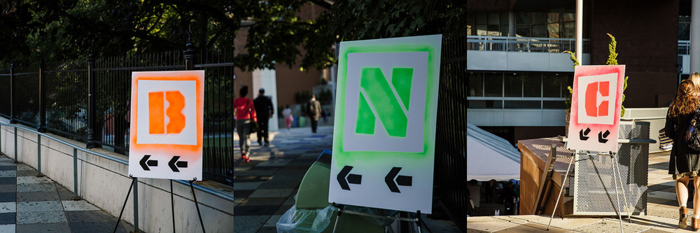
Arrows pointing to the BNC venue.

Tablecloths for all kinds of things. Some of the sponsors also got their own.
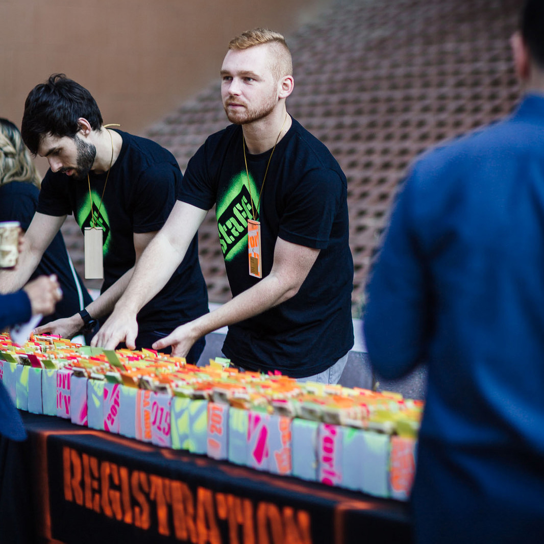
We even spray-painted all the boxes used to hold the badges during registration. Completely unnecessary but it established from the very beginning that this was going to be non-stop fluorescent fun.
Instagram
The design industry always talks about how to quantify the success of a design solution. For us, it’s the video below.
Nearly 100 Instagram posts of attendees flaunting their badges, bags, and program.
When the people that come to the conference are excited to be there and excited about the materials they are receiving they want to share it and say to their own circle of friends, “Check this out! It’s bananas!” that’s when we know what we did is a success. The hours we put into making the materials this year is an astronomical dollar figure that we will never make back but the satisfaction of designing something that our peers find cool is ROI enough for us and if someone in that network of shared Instagrams goes “Hey, that #BNConf sure looks cool, maybe I will attend next year” that’s just icing on the cake. Or spray paint on the tote.

