3598QCA TYPOGRAPHY AND CONTEXT
For the Major Project in this course, you will be provided with multiple project briefs to select from. All briefs are intentionally open-ended to allow for personal interpretation and direction. Your outcome should represent a full Trimester of consistent research, experimentation, reflection, and refinement. Participating in class workshops, discussing your work with your classmates, and sharing your progress with your tutor will be essential to your success. Your final outcome is also to be creatively and professionally showcased on Behance.
Design a typographic work exploring the theme Lost. We expect you to investigate the widest interpretation of the theme from historical, cultural and global perspectives, drawing upon references to different eras, societies, social groups, generations etc. Be selective and discerning in your interpretation. Your research will undoubtedly uncover a breadth of information – everything from the profound to the ridiculous. It is your job to consider the tenor of the communication. Is it a serious, forensic interrogation of the theme, or is it a little more light-hearted? Does it have a very specific/singular narrative drive or is it eclectic, fun and informative? Whatever the case, we would like you to lose yourself in this theme and create a typographic tour-de-force to please the eye and stimulate the brain.

The main purpose of this piece is to attempt a visual narrative of insanity using typography as a catalyst. Furthermore, it aims to evoke an emotional response of fear and bewilderment within the audience through the use of tropes and visual rhetoric. The piece is intended to be physically interacted with; allowing the audience to form an emotional bond through its tactility. From my observations of other people interacting with the scrapbook, it appears that they form a deeper relationship with a physical piece as opposed to it being delivered via digital means. Often, the audience will utilise touch and smell as they peruse the scrapbook and this delivers several layers of experience that a PDF, may not be able to deliver. More importantly, the content is designed to invite the audience in coming up with their own story or conclusion to the piece. In summary, all of these elements mean that the scrapbook is 1) a piece designed to be interacted with using more than one sensory organ, 2) a piece that requires time and emotional investment from its audience, 3) a visual narrative that takes its target audience towards the precipice of isolation and madness.
This piece is primarily aimed towards an audience who have a penchant for obscure and old things (as the scrapbook is something that is meant to be discovered by ‘accident’ — think of a person who collects antiques, rarities, or regularly visits flea markets and second hand stores.) This could mean young adults between 25 - 30 or older audiences between 40 - 60 who are more familiar with typewriters and handwritten letters. Lastly, this demographic may be described as admirers of mystery and horror literature / films.

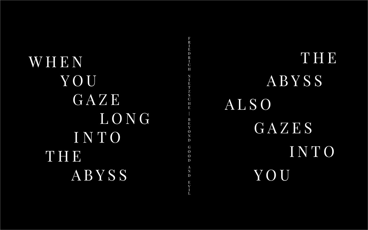
I drew inspiration from several sources — one of the most obvious is the work of H.P. Lovecraft, musician IHSAHN, James Victore, and antique books. After visiting "The World of the Book" exhibition in Melbourne, I attempted to deconstruct the visual elements that I observed from the pieces on display. I decided to age the pages within the scrapbook in order to give the book the quality of authenticity and antiquity; appealing to the Ethos of the audience. The feedback from the audience was incredibly positive, with some remarking that the scrapbook indeed looks like its existed for several decades already. Furthermore, this technique gave the scrapbook a distinctive scent which some individuals thought smelled like an old bookshop or basement. This I believe, is very important in adding another layer of engagement with the audience.

Creating the piece itself was a rather straightforward process — aging the pages and drawing the visual elements required the usual skills as a designer. However, the content required some unorthodox approaches in order to be created. Method acting is a technique utilised by actors to create realistic emotions into their performance (Hamden, 2010) In order to come up with realistic content, I needed to empathise with the character who “created” the scrapbook. As such it was necessary to undertake two things: firstly, to understand and “play” the protagonist in “The Outsider” through the lens of an autobiographical interpretation (Joshi and Schultz, 2001) and secondly, to create a visual narrative which attempts to expand on the story by using visual cues that give away information about the protagonist. As a result, this allowed me to give the scrapbook a personality of its own; making it a more dynamic piece as opposed to more orthodox visual outcomes. However, I have learned that using the art of Method acting can have negative consequences on the actor’s emotional and psychological well being. This is attributed to raw or unresolved emotions seeping into the character the actor is playing, thus adding to emotional fatigue (Grandey, 2001). As such, it became important to be aware of how much of this method is being used throughout the process and to also set limitations and boundaries.
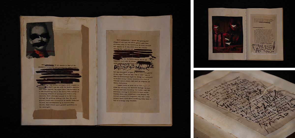
The scrapbook has two distinct parts: first, is the story “The Outsider” by H.P. Lovecraft and the second part is a series of cryptic letters from an unnamed author loosely based on Lovecraft himself. There are numerous clues, messages and subliminal verses that gives fragments of information to the target audience. The piece is intentionally left unfinished to allow the audience to come up with their own conclusion as to what actually is happening within its pages.

Rhetorical devices and Tropes are used heavily throughout the piece. For example, In order to evoke the emotional response of fear through Pathos (Hanno, 2008), I needed to take the audience through a visual journey. As such, disturbing visual devices are heavily employed throughout the pages. A consistent remark from the audience revolves around how deeply personal it felt when they were going through the pages. In addition this, staining the paper and distressing the pages added greatly to its authenticity (Ethos) and gave the illusion of the scrapbook as being a real object.

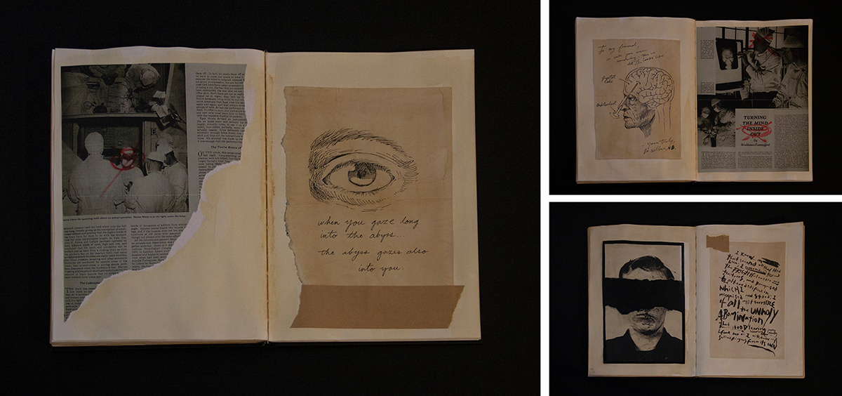


Lastly, the trope of Antithesis greatly played a role in visually translating the above concepts into a physical outcome. Antithesis is defined as a figure of speech which places contrasting ideas in direct opposition with each other; creating a juxtaposed effect (Britannica, 2019). This is highly evident in the varying handwriting styles, typefaces and content to add to its mystique. Juxtaposing the content with its visuals was also highly effective in visualising insanity. A common remark from the audience was how the contrast between content and imagery was very dark and disturbing.
Overall, the experience making this outcome is an incredibly fun albeit bewildering at times. Synthesising all of the feedback and research into a powerful piece was something that continually evolved in the twelve weeks I have worked on this project. I found that creating the content was a unique experience on its own — oftentimes, its ritualistic nature lent to its obscure and almost occult quality. In addition, acting out a part to create a convincing set of "letters" was a process I have never done before; and as a result, it allowed me a greater degree of self-reflection wherein I felt I was reliving past experiences with a brand new perspective. Given more time, I feel that I can make this into something more. I have always felt that the "letters" needed more character to them as there were times when I found myself writing in my own handwriting instead of the character I was trying to play. Despite this, I can say that this entire experience was well worth the effort that I have put in.


