

“
From stodgy to chic.
”
— The Seattle Times


OVERVIEW
The Hotel Sorrento opened in 1909 at the tail–end of art nouveau and just before the Alaska–Yukon–Pacific Exposition, a world’s fair held in Seattle to highlight the development of the Northwest. In the last century the hotel has seen many changes, but it has always remained a cultural hub and held strong ties to Seattle’s literary community. We rebranded this Seattle landmark to mirror its timeless features and to live up to its role as a cultural hub in the Seattle literary community. We also built a website that is easy to use for booking stays and viewing events.
APPROACH
In creating the identity and branding for the hotel, we wanted to enliven the spirit of this Seattle landmark and drive home its uniqueness with a fitting-mascot. For inspiration we studied vintage publishing house colophons and matched a shade of green drawn from a vintage book cover. The Sorrento attracts the movers and shakers from the arts community, patrons who dress to be seen and speak to be heard — evoking the spirit of a peacock. We were also inspired by the mythology of the peacock — its tail holding the many eyes of the cosmos and acting as a symbol of immortality — which pays homage to the hotel’s impressive longevity.
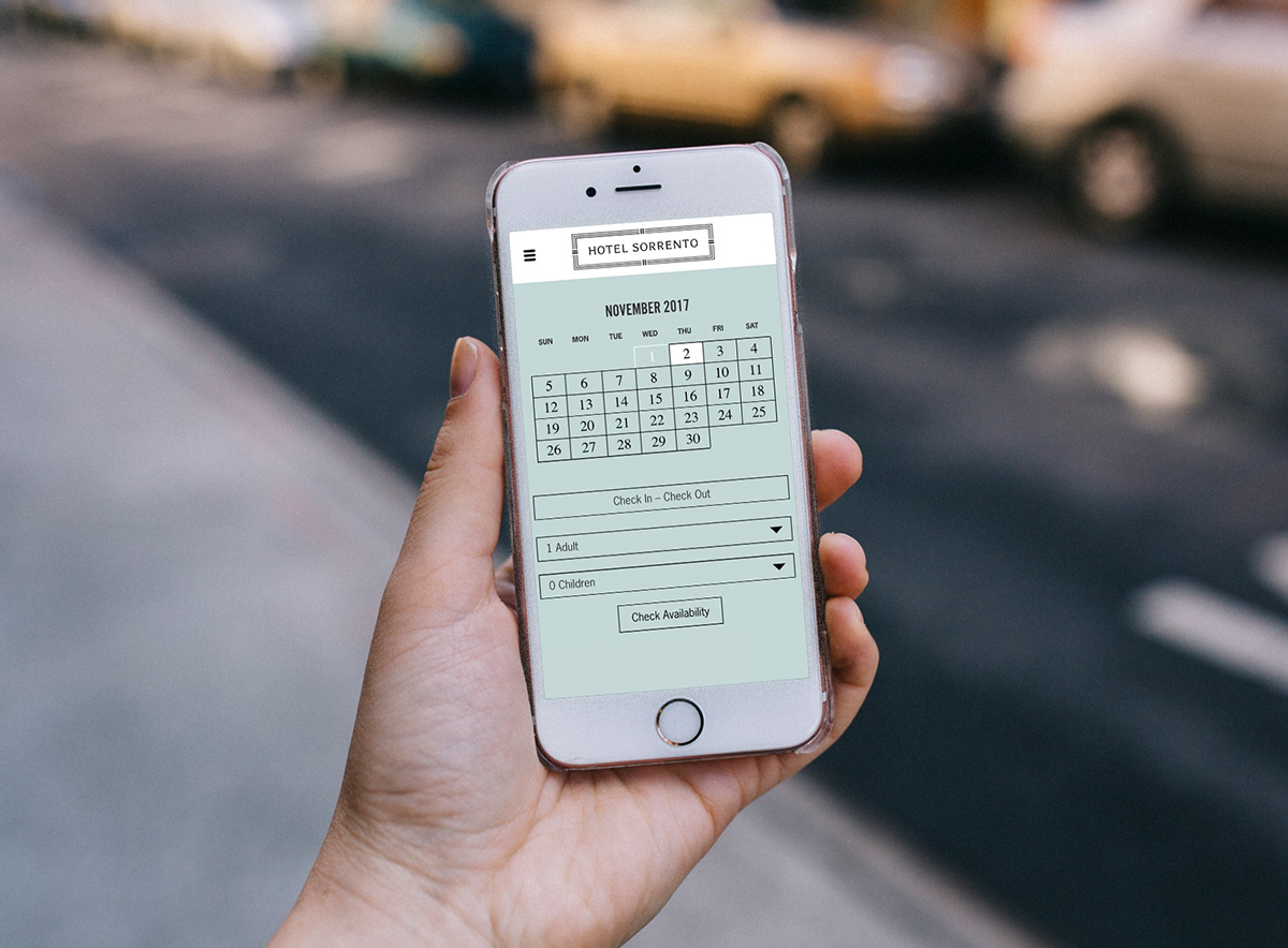
In creating the website we envisioned a seamless mobile–first experience that allowed patrons to easily and quickly reserve a room, navigate their way through the Sorrento’s event offerings and introduce them to the hotel’s incredible story. We reorganized and restructured the web content to ultimately create a simple and clean user experience.


