


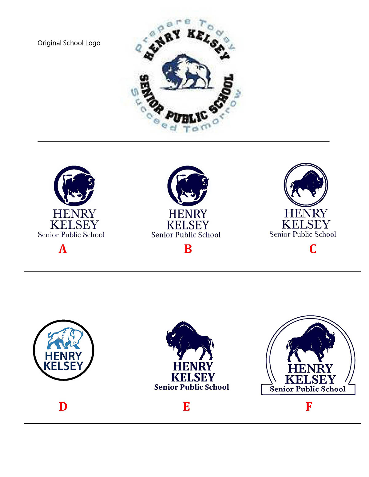

For the Henry Kelsey logo, the school had an established image, they wanted something cleaner, modern, and more visible than the previous. So I worked up variations while staying true to the core elements needed for the School. Ultimately the final option you see here was the way to go that allowed for color, and a dynamic sense of their school pride.


