
What is sensory branding?
Sensory branding has been defined as marketing that forges an emotional association with customer by appealing to their senses in order to influence their feelings and behaviour. Brands can evoke emotional associations in the customers’ minds by appealing to their senses.
This approach is based on the idea of engaging the consumer with a brand through unique experiences by focusing on human emotions, senses, imagination and interactions. Experiential marketing strengthens the identity of a product and creates a link between the atmosphere at the point of sale for a product and the purchasing behaviour.
Aim
My aim, as a graphic designer, is not only to create effective visual solutions that deliver a message through various media by employing visual elements but, to employ and apply methods in design that will influence consumers at a subconscious level, by triggering their emotions and memories.
Due to the fact that there are millions of brands on the market and the brand world is changing very rapidly, the brand marketing strategy with brand’s identity is not enough for success nowadays. Thus, in order to differentiate from the competitors and to establish a successful brand a new strategy and methodology such as sensory branding is required.
Project
The project is based on the research and theories in psychology, consumer’s behaviour, neuropsychology, branding strategies and brand architecture. The project’s aim is to describe the significance of multi-sensory applications in graphic design and branding practice and to introduce it to graphic designers and creative. It supports the notion that sensory branding strategy, which involves neuropsychology, has a greater impact on consumer behaviour and experience than traditional conventional techniques. Furthermore, sensory branding creates emotional associations with the brand by appealing to the consumer’s senses in order to influence their feelings and purchasing behaviour.
The chapters in a book are structured as a step-by-step guide from a general understanding: what sensory branding is, the importance of it in branding practice, to the description of the neuropsychological and physiological processes of how the human brain works in particular sensory input as well as the basics of brand architecture. The final chapter provides the reader with a description of sensory branding strategy and its possible implementation in practice. Throughout the book, case studies, illustrated examples and information graphics highlight the key activities undertaken by scientists, researchers and brand companies. Detailed and illustrated case studies cover a diverse range of industries such as automobile, pharmaceutical, telecommunication, computer industry, travel and hospitality, gaming industry, entertainment industry, retail, food industry and fashion which are now becoming both sensory branding adaptors and followers.


Format
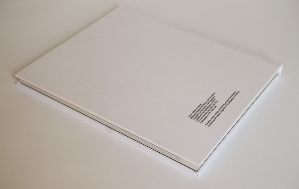
The decision to create a book with in a non-standard format (30x25cm) came from the evaluation and analysis that content should determine the format as well as the experience the reader has while interacting with the material will affect the type of response the material evokes. As the content is research about senses and their affect on human beings, I believe the large format of the book, bright colour illustrations and colour chapters would appeal to ones sense of sight. In order to meet the professional standards of the publication I commissioned a photographer who produced a series of abstract images empathising with the content of the book. To my point of view, illustrations should resonate with the mood of the subject, and abstract photographs seemed the best matched with the idea of symbolization of human senses, as the senses are something ephemeral and abstract.
Paper stock
The tactile qualities of a printed book are evidenced by weight, surface, texture and inks all play a part in the personality of the book. To my mind, paper is absolutely part of the picture, and it can enhance the vibrancy of the imagery and overall design. Different paper qualities affect the intensity of printed ink - there is a stark difference between printed matte and gloss surfaces. When ink adheres to matte paper, it is absorbed and has no shine. Matte finish is used for printed-word texts such as newspapers and books, and tends to be easy to read. However, ink printed onto gloss paper stays on the surface, so lighter hits the paper below and bounces off, giving a deeper, more intense colour. This quality is used for book covers, magazines, brochures and photo books. But satin paper comes somewhere between the two, giving a slightly less intense colour than gloss, but without the shiny surface. I have chosen a satin laminated paper to find a compromise between the paper stock for the printed-word text and a paper-stock for the bright colour illustrations. Satin laminated paper stock also adds a tactility and impression due to its smooth and textured coating.
Style of layout
I have used a combination of symmetrical and asymmetrical layouts design. While the definition of asymmetry is the lack of symmetry or equality between two half, to my point of view, it is not lack of balance as some wrongly assume. I have used asymmetry to create balance and harmony even though two sides of my design do not mirror one another. Asymmetry can be one of the most impactful concepts in a design toolkit. I have used asymmetry as an attention-grabbing technique that is interesting and thought provoking; it can be heavy but natural. One of the places asymmetry is really beginning to bloom is in the minimal design. I have been inspired by the minimal design of the Barbican Centre brand identity. I have used the balancing act between white, or negative space, and elements in my design to create a contrast so this will direct the movement of the eye across design. I have used bright hues and photographs with bold white or black typography on a page for the contrast and impact. Chapters divided by colour are used to highlight various subject area of the content.


