
From the brief:
In essence, they are a group of groups of Christian educators, who seek to support Christian education in Canada. So that in mind, they're looking for a logo that communicates (in order):
Christian Education, Canada, Community
And they wanted to be perceived as:
Professional, Warm & Friendly, Forward-thinking & Innovative Leaders
Professional, Warm & Friendly, Forward-thinking & Innovative Leaders

Option 1:
A fairly safe approach: four red buildings, representing a community of schools, with a cross at their center, and the three upper ones subtly alluding to a maple leaf.
When they work together (where they overlap), and when they have Christ as the common focus, they are stronger, hence the stronger red in the center.
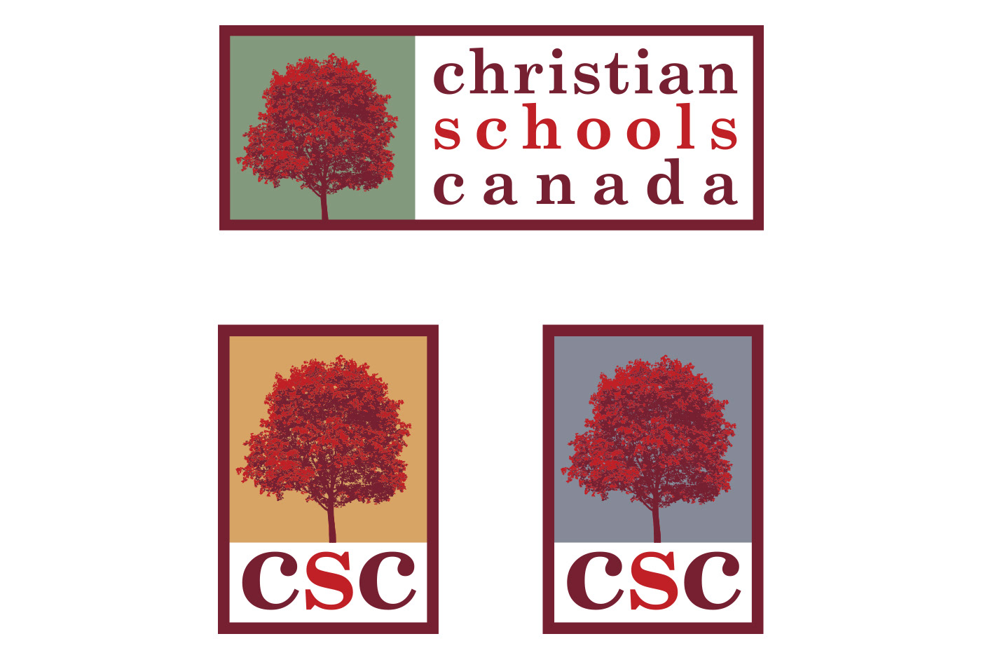
Option 2:
A more figurative approach: a tree is a universal symbol for learning & growth, and by making it bright red, it can symbolize the burning bush, or a Canadian maple tree.
The simple serif type is reminiscent of type in a schoolbook or the Bible, while the over-all colour palette evokes ‘Canada’.

Option 3:
The idea of a flame over a book or a torch is a familiar symbol for Christian education, and this direction attempts to strip that down to its essentials, in a professional yet innovative way.
The three flames represent the community of school associations (the ‘light bringers’), who are getting brighter as they go. They are also reminiscent of fall trees on a plain, giving the Canadian feel.

