

These are my interpretations of the Adobe logo:


A time lapse video of the project:
The Process:
My idea for the project was to turn one room of my studio into a completely new universe for the Adobe logo.

I built a minimalistic set up for the room and painted it white. I wanted to leave everyday objects such as the door handle and the tiling on the wall visible as small clues of the original room.

For getting a better idea of how the Adobe logo would react with the surroundings and the drawing I built the Adobe logo from ply wood.

After I had composed the locations for the light paintings I started to work on the forced perspective drawing and the characters.

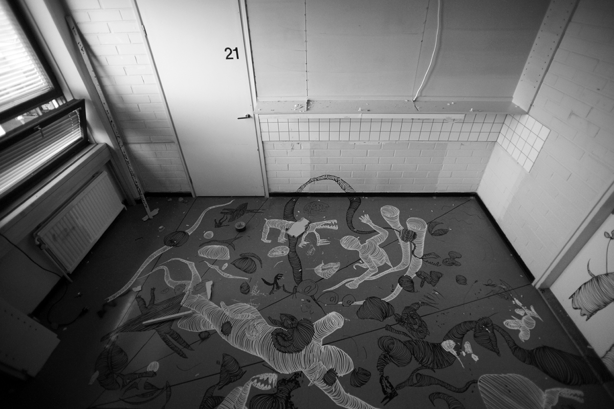
As you can see from the finished drawing some of the lines go through even four times a 90 degrees angle change and had to be drawn so that the line still looks straight to the main camera's angle.

Here I tested how the Adobe logo would work if I would close the shape inside a frame but gave up from that idea in the final version.

In the final version of the drawing the forced perspective drawing hides the physical shape of the room quite well thus creating an illusion of two different spaces. Some of the characters shapes are left open so that they can be completed with light drawing.

I drew the light characters by tracing my body in right positions with a small white led by using long exposure on my camera in a completely dark studio. The forced perspective drawing was then carefully lit with a very dim flashlight from a close distance in order to highlight just the right areas of the drawing.
Version II:

After I had finished the light painting for the first version of the logo I painted the studio completely black for the second version.

The trickiest part was to draw the Adobe logo upside down while maintaining the perspective shift right for the final viewing direction. I decided to make the drawing this way so that I could create the light paintings to look like they would be flying over the logo.

After I had marked the spots for the light paintings I started to work on the characters.

The finished drawing which is cut from the middle by a 90 degrees angle between the wall and the floor.

Test shot for the lighting of the drawing. The white permanent marker drawings were lit with a small flashlight in a darkened studio while the camera was shooting on long exposure.

The black & white version of the light painting. Even though the photo was shot in b&w I used a green colored led light in order to get more nyances for the light trails.

I tested several versions for the light painting, here I used green colored led light to highlight the figures.

In this version of the light painting I used rgb led for the light figures and to trace the white permanent marker drawings. The lines in the drawing were carefully traced with the rgb light from a close distance in order to create the smooth color changes in them.
-------------------------------------------------------------------------------------------------------------------------------------------------------

Janne Parviainen is one of the most well-known light painting artists and his work has been featured in various magazines and web publications such as The National Geographic, Wired, Juxtapoz, Metro, Telegraph and Der Spiegel.
http://www.jannepaint.com
http://www.facebook.com/jannepaint


