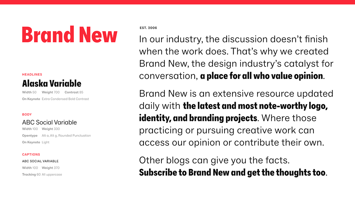
Established in 2006, Brand New is an extensive resource updated daily with the latest and most note-worthy logo, identity, and branding projects. Part of UnderConsideration, co-founded by Armin Vit and Bryony Gomez-Palacio, Brand New has a dedicated and trustworthy audience of 31,000-plus subscribers (to which we are eternally grateful). Publishing daily, multiple times a day, across a flexible range of editorial categories, Brand New offers a place for all who value opinion and who enjoy a healthy dose of edited press releases and curated and thoughtfully organized JPGs, PNGs, GIFs, and MOVs.
The new identity has been created by UnderConsideration in collaboration with a few key players: London, UK-based Rob Clarke on logo development; Leeds, UK-based Mat Voyce on logo animations; London, UK-based Ragged Edge on tone of voice; New York, NY-based Plural on social media strategy; and Norfolk, VA-based Prince Ink on merch.
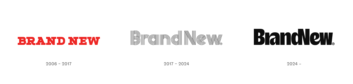
Logo evolution.
The previous and original logos for Brand New were not developed through any kind of rigorous process. For the first one, we picked a typeface, Village’s Apex Serif, and for the second one, we picked a typeface, Lineto’s Prismaset, and customized it. The new logo was born from one of those serendipitous moments of life when an email arrived from Frere-Jones Type announcing its new Community Gothic type family arrived, which we thought was quite swell and immediately typed out “Brand New” on their type tester in the Condensed Black weight. It looked pretty good and the relationship of the “ra” caught our attention as something that could perhaps become a ligature and then we thought “Ooooh, the ‘d’ and the ‘N’ could also be a ligature”. We took a screenshot of it, brought it into Photoshop, and it looked terrible — see directly below — but we knew it had potential. Enter Rob Clarke.
Original idea by UnderConsideration.

Brief.
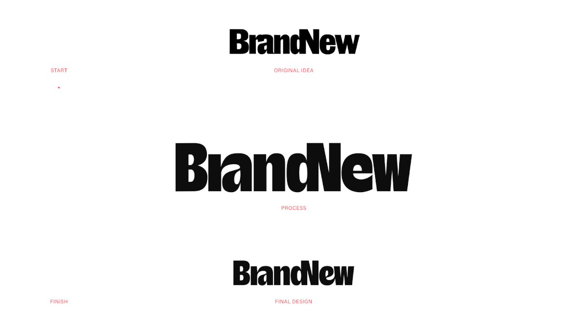
From exploration to final design process.
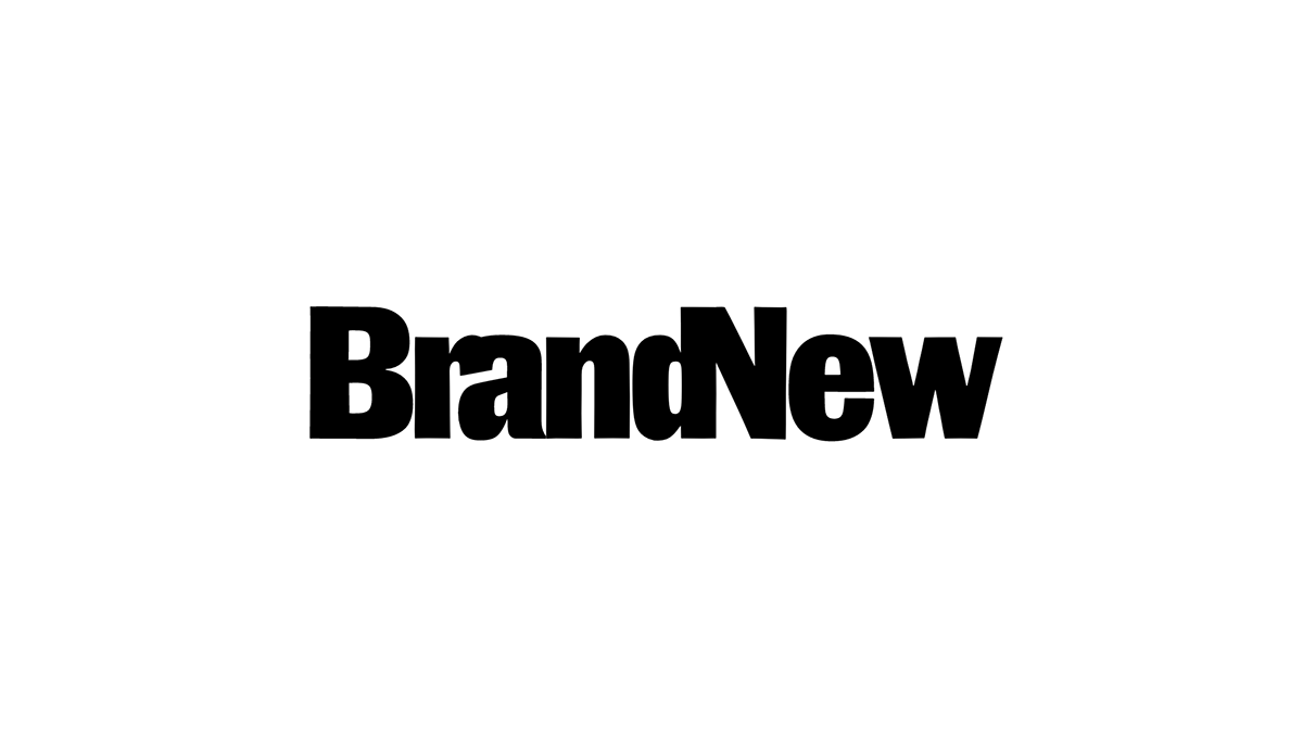
Logo. Final design by Rob Clarke.
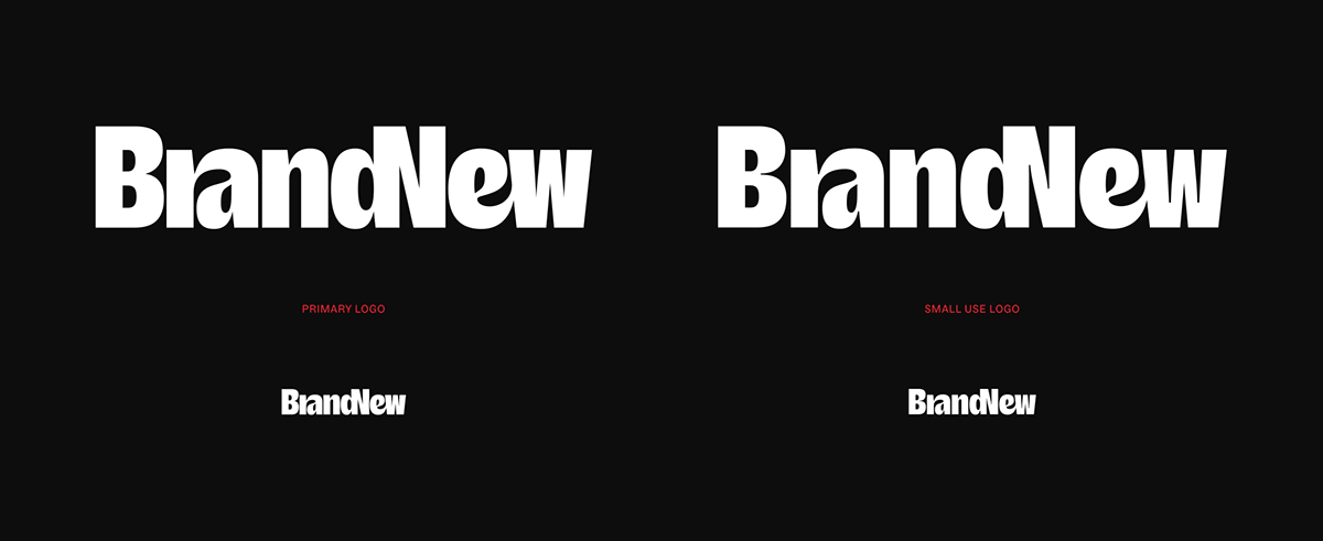
Regular logo (left) and small-use version (right).
While we explored ink traps early on we knew we wanted to avoid them at all costs given their trendiness but we also wanted a chunky wordmark which means that when the logo is reduced, the tight counterspaces do start to suffer so we asked Rob to draw a small-use version with ink traps that serve a purpose. On the logo on the right you can see it looks terrible when used big but when it’s reduced, it ends up looking like the big version on the top left.
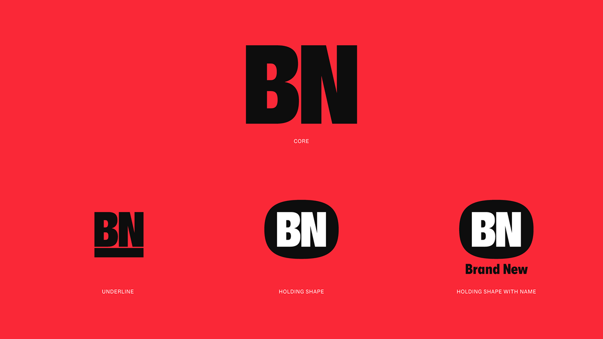
Monogram and its variations.

Where the holding shape for the monogram came from.
For a very brief moment we tried to come up with a contrasting “BN” monogram in another style or in lowercase but we ultimately decided to keep it simple and simply reuse the “B” and the “N” from the wordmark. It can be used on its own, it can be accompanied by a thick rule, and it can be placed inside a fun squircle-esque shape that originated from the contour of the “e”. Not sure when it might be needed but a holding-shape-monogram-plus-name-below-it are designed to fit perfectly in a small square.
Logo animation with color trails. By Mat Voyce.
Logo animation with stylistic shifts. By Mat Voyce.
Monogram animations. Mat Voyce.
One of the things that Plural reiterated to us about social media, Instagram in particular, was that video is king and that the algorithm favors moving content over static so we knew this new identity had to have motion and that created a demand in our minds for having some cool logo animations. We worked with one of our favorite animators, Mat Voyce, who can make anything bounce and feel alive. For the logo, we ended up with two very different styles, the first one with the trails of colors and the second one with stylistic shifts. The latter is a little gratuitous at the moment given that we doubled down on the trails but we liked that it set the tone for coming up with very different animation options in coming years.
Color palette.
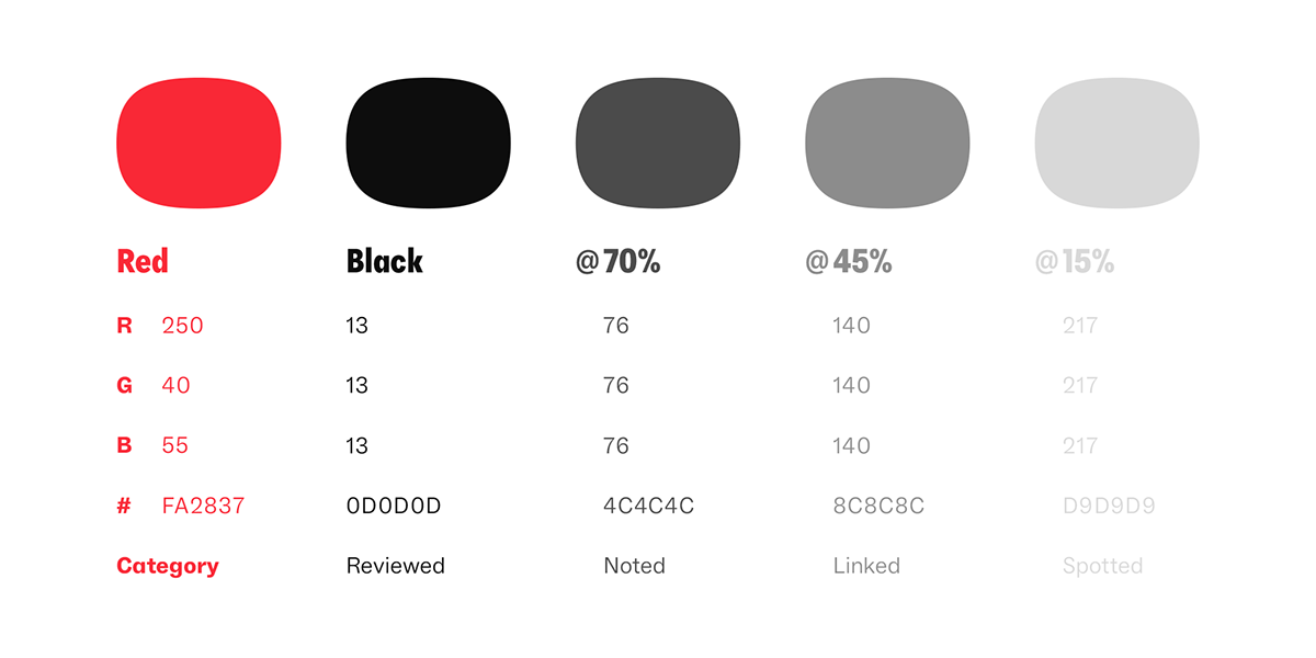
One of the biggest changes is the color palette. The mint green and pastels of the past seven years were nice and useful but they were not a strong or exciting color palette and we wanted to have a color combination that would more clearly make Brand New identifiable. There is nothing particularly unique about red and black but it’s always been a winning combination, so we evolved the red color we had used previously as our hover effect with just a hint of orange and we chose a black (at 95% blackness, just to take the edge off), supported by three shades of gray. Each shade now also represents an editorial category, darkest for Reviewed, lightest for Spotted, with red as an accent throughout.
Typography.
As a big fan of 1970s typography and the ever-popular Futura Condensed we selected a contemporary take on it in Newglyph’s Alaska, specifically its Extra Condensed width. (We never use any other width.) It’s bold, it’s chunky, it’s old school, and it has personality without it being too much. It also helps that it’s somewhat similar in proportions and construction to the logo. For body copy we went with Dinamo’s ABC Social, a crisp grotesque that looks good in small, medium, and large sizes and its stylistic sets allowed us to have single-storey “a”s and non-squiggly “g”s to match Alaska. In application we use Alaska for headlines and to add emphasis to words within sentences typeset in ABC Social.
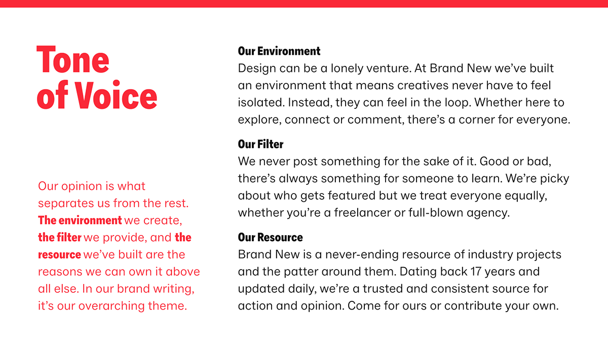
Tone of voice. By Ragged Edge.
Our biggest struggle and where we sought the most help was the tone of voice. We both know exactly what Brand New is and what it offers but we have never been able to vocalize it in an engaging, convincing, actionable way with the main goal now being to attract new subscribers. We turned to Ragged Edge, who have consistently created some of the best copywriting and tone of voice for their clients and asked them to sprinkle some of that magic dust on Brand New. They wrote the “about us” text in the typography slide, the new tagline “A place for all who value opinion”, defined the values of our tone of voice, and got us started with a library of copywriting that we will use this year and then build upon in the future. We defined three categories of tone of voice: A) Calls to action to attract subscribers, B) Attitude statements to help us establish some much needed self-confidence, and C) Insider, if-you-know-you-know bits that regular readers will get.
Self-promotional Instagram posts. White backgrounds are call to action, red backgrounds are attitude statements, and black backgrounds are insider bits.
Self-promotional Instagram stories.
Self-promotional LinkedIn post.
Apart from our own posts we, of course, have to share the work we cover…
Project-based Instagram posts.
Project-based Instagram stories.
Instagram reel with weekly recap.
A key part of this evolution was streamlining and improving our social media content. One recurring piece of feedback we heard about our Instagram feed is that the thick Brand New-branded borders were too much so we finally got rid of those. This actually led us to adopt a new, subtle recurring element in our content, a thick rule at the top of each post or story. It’s not like it’s a super identifiable element but it’s a connecting thread across social media content. We are also now introducing weekly reels summarizing all of the projects shown the week prior. They get a bit long but if you have time to spare, it’s a fun watch. Fun fact about all of the motion work above… it’s all done in… Keynote. LOL. We have a slim understanding of After Effects so in an effort to be as self-reliable as possible we are using the tools we know inside and out, so we have some relatively fancy templates in Keynote to produce all of this on a daily basis.
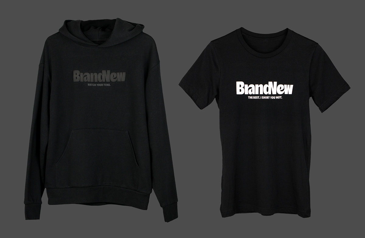
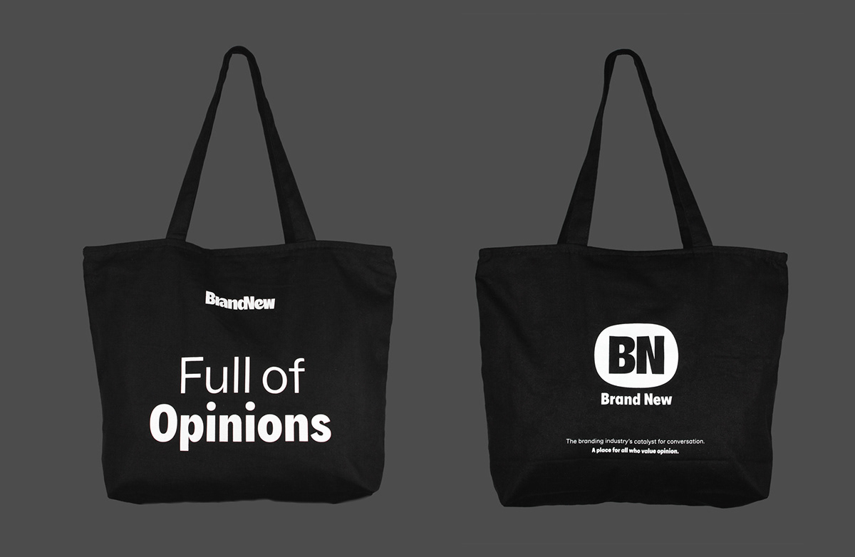
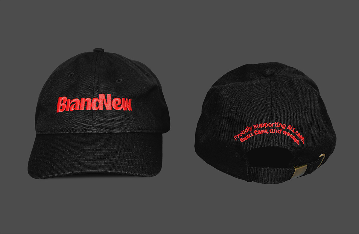
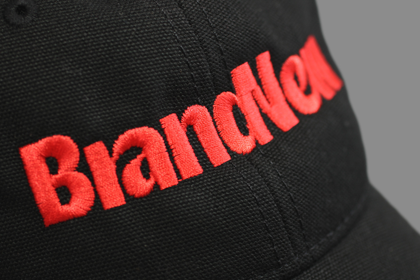
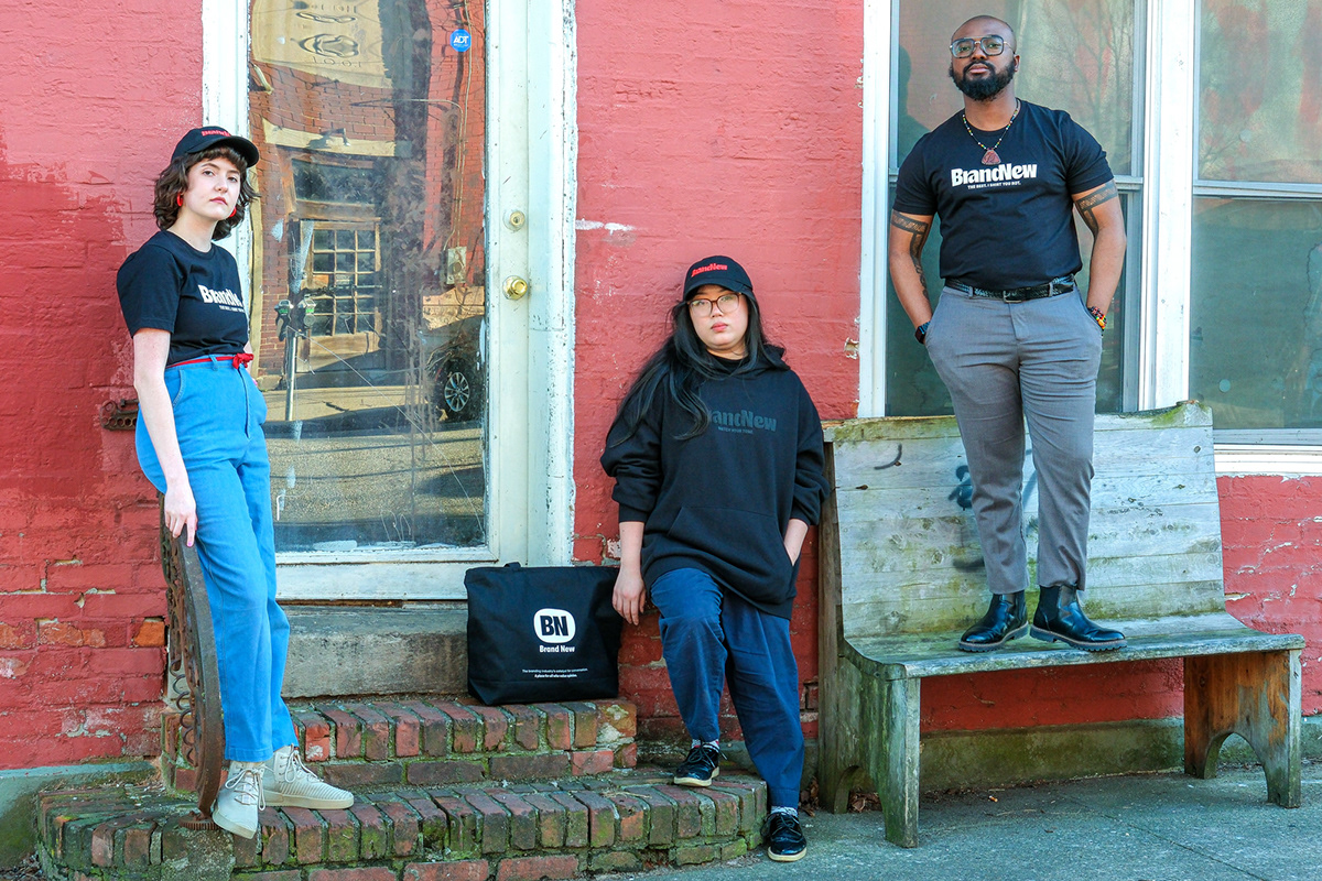
Merch — not a single mock-up! (Scroll to the end of the post to buy some!)
Since we were feeling pretty good about the logo, we took the plunge and created some slick merch that we hope you enjoy (and buy!). Production runs are small so quantities are limited. Everything is sourced from and produced in the U.S. and we’ve selected quality products that will last. Prices aren’t cheap but unless we produced things overseas with lesser quality items there really is no way to lower the prices in this day and age. These are priced to break even after production and fulfillment costs, with perhaps a small profit to help fund new products. If these initial products sell well our goal is to introduce new items every two or three months. So, feel free to head on to our dedicated shop and get some!
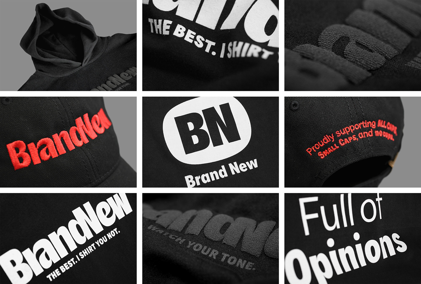
Merch details.
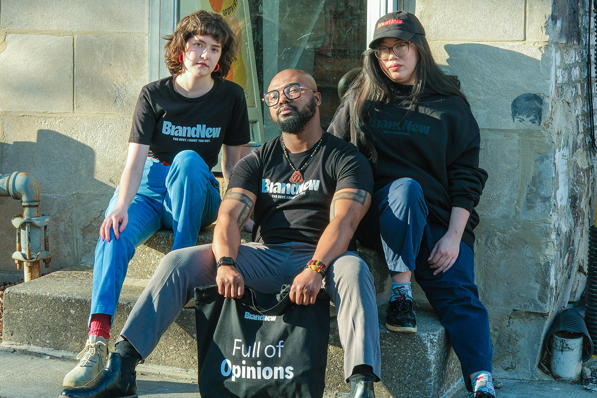


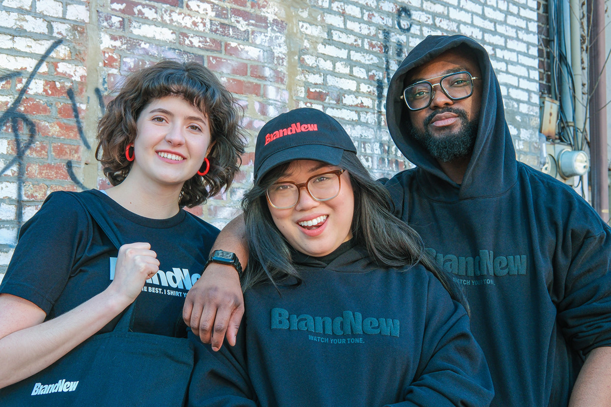


Merch, lifestyle edition.
Overall, we are very pleased where we ended up and also very excited about finally having something to say and a way to say it visually and verbally to get others as excited for Brand New as we are to keep on growing and nourishing this sliver of the internet for years to come.


