


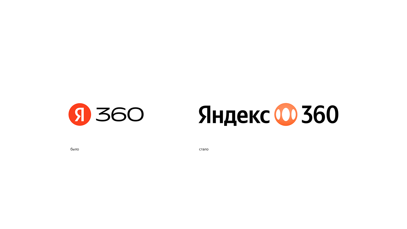
New logo and identity for Yandex 360
The new logo is a dynamic symbol that reflects the metaphor of the rotation of satellite planets in the solar system.
The solar system serves as the foundation for a full graphic language, used as a container for images or type.
All Yandex 360 services: Mail, Disk, Teleconference, Documents, etc. have a unified system for communication.
The color palette of the new identity demonstrates the technological solutions and their interrelation with each other: orange symbolizes personal opportunities, digital lavender — technology, and black — strength and rigor.


Team
Design — Ann Bolshakova, Vova Bolshakov
3D/Motion Design — Egor Shulgin
Motion Design — Anastasia Mukhina
Design — Ann Bolshakova, Vova Bolshakov
3D/Motion Design — Egor Shulgin
Motion Design — Anastasia Mukhina
Photo — Nadya Atachkina


