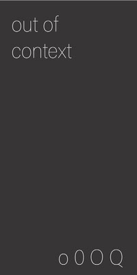
out of context

The project
The assignment at Uni was to conceive and design a book of 10 cm x 20 cm using only typography and interpret the theme of everyday life.
Idea
You know when you're hanging around with your friends and you can't stop laughing at a stupid thing one of you said? The idea was to write down various humorous actual quotes, conversations and situations of me and my friends.
Design
I designed the book in the style of a literary drama due to its modest composition: the list of characters on the first page, the dialogues are visibly separated, and the description of the room or situation serves as an introduction to the story. I did some research on the usual graphic style of drama books and found out it is very often a free-format. The graphics totally depend on the artist and what they want to say (or show on stage since that is the purpuse of writng plays). There are a lot of scenes in the book, which is not usually the case, but because they are based on time and date it works.
I designed the book in the style of a literary drama due to its modest composition: the list of characters on the first page, the dialogues are visibly separated, and the description of the room or situation serves as an introduction to the story. I did some research on the usual graphic style of drama books and found out it is very often a free-format. The graphics totally depend on the artist and what they want to say (or show on stage since that is the purpuse of writng plays). There are a lot of scenes in the book, which is not usually the case, but because they are based on time and date it works.

The name — out of context
The information in the book does not give an understanding of the whole story, but only an insight, so the name out of context is very suitable. A lot of dialogue, but descriptions as well, use a lot of slang. The reason it is in small caps is that I think that is the way to show slang graphically and not just with words.
It is an old-style serif typeface designed by Hermann Zapf; initially released in 1948 by the Linotype foundry. It was named after 16th-century Italian master of calligraphy Giambattista Palatino. It is based on the humanist fonts of the Italian Renaissance, which mirror the letters formed by a broad nib pen; this gives a calligraphic grace.
Since I was the one writing down quotes and I wanted the book to have a drama style, I think this typeface is perfect because it gives a personal touch but also a touch of the renaissance.


