

Hoang Dung

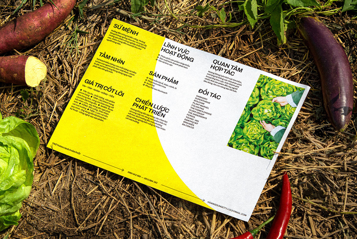
Befriending farmers since 1990, Hoang Dung has defied the common prejudice that fertilisers are harmful to the environment while proving a co-prosperity is possible. The 30-year journey of manufacturing, importing and distributing organic products has recognised the brand for its dedication and quality. Racing in the era of changes, Hoang Dung desired to further its appeal to its growing younger and more diverse demographic while moving its budget-friendly positioning to a more premium price segment. Accordingly, the work we did with Hoang Dung encompasses brand positioning, identity system design, product applications, and messaging.
At the centre of the new identity, the brand mark has been designed to be as flexible and adaptable as possible for its many different applications, with an interplay of shapes. The negative round shape on the top left corner alludes to the sun, which works seamlessly with the projection-like pattern below – the bevelled slashes embody sunlight and growth, with a touch of dynamism and liveliness. In addition, the configuration of the brand name creates a right angle, presenting the firm standing as a pedestal for customers’ success.
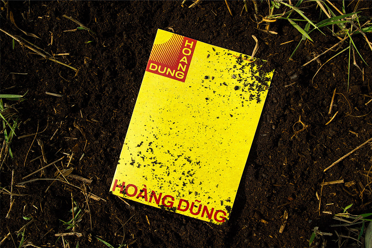


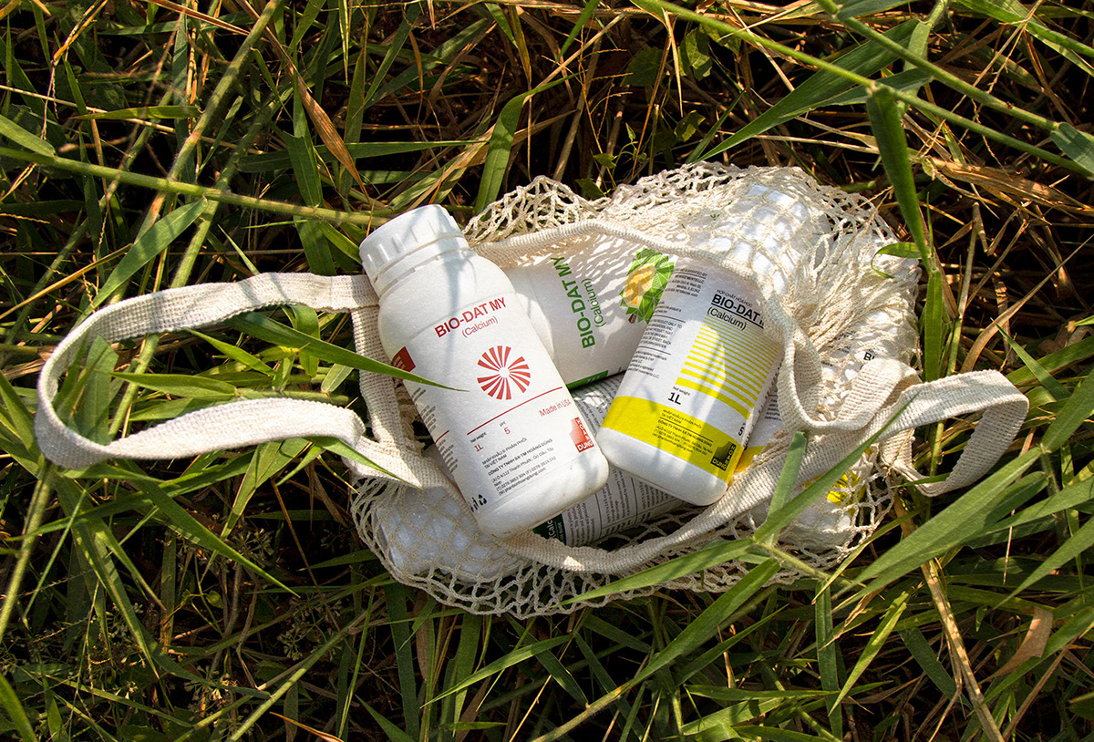
Our design team also employed a contrasting, eye-catching use of colour for the new visual system. A warm, vivid colour palette of red and yellow forms the primary brand hues, while colder and more neutral tones like green, purple, blue, and grey act as complementary colours. Archivo is the primary brand typeface. Working in harmony with other graphic elements, it conveys a balance of modernity, trustworthiness and subtle confidence.
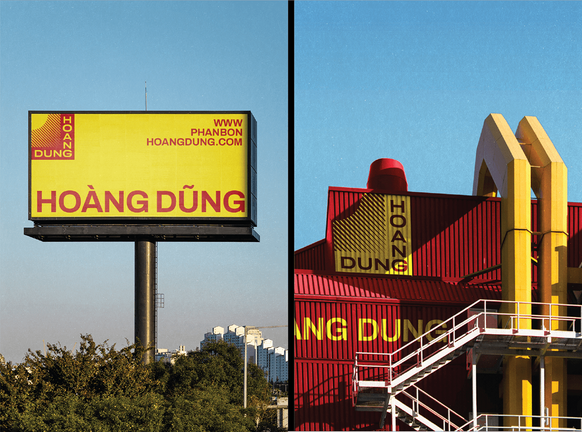

With a more in-depth focus on the quality of its products, the new visual identity highlights Hoang Dung’s mission, manifesting the idea of bringing vital energy and complete protection for a bumper harvest. Diagonal crosses tie all constituent parts of the brand together, from the brandmark to imagery and iconography, which mirror the company’s values: generative, responsive and professional. Simple and modern, it acts as a framework to showcase the colour of Hoang Dung and allows its products to remain centre stage.

Bringing to life a new signature brand identity is not only about devising a unique visual treatment; but, more importantly, a new perception treatment. Thus, we believe rebranding works on brand as tillage works on soil: from the visual land xolve has enriched, the sweetness of success will subsequently be brought forth to Hoang Dung.


Client: Hoang Dung
Branding Agency: xolve branding
Creative Director: Khoa Huynh
Project Manager: Linh Phan
Brand Designer: Thanh Binh, Thao Anh Le, Quynh Ai
Illustration: Thao Anh Le
3D Visualization: Khoa Huynh, Quynh Ai
3D Motion: Khoa Huynh, Quynh Ai
Photography: Jackbabe, Quynh Ai
Copywriter: Thanh Ngoc
Assistant: Khanh Linh


