
Mallory began as an experiment in mixing typographic traditions, building a new design with British and American traits. My father was American and my mother is English, so I also had a more personal motivation, to make a typeface that mirrors my own heritage. Mallory also includes “MicroPlus” versions, which simultaneously address text sizes on screen and tiny sizes in print. The idea builds from the history I learned from my mentors like the late Mike Parker and is an attempt to use history to bridge the gap between print and digital environments. Designed 2014–2015
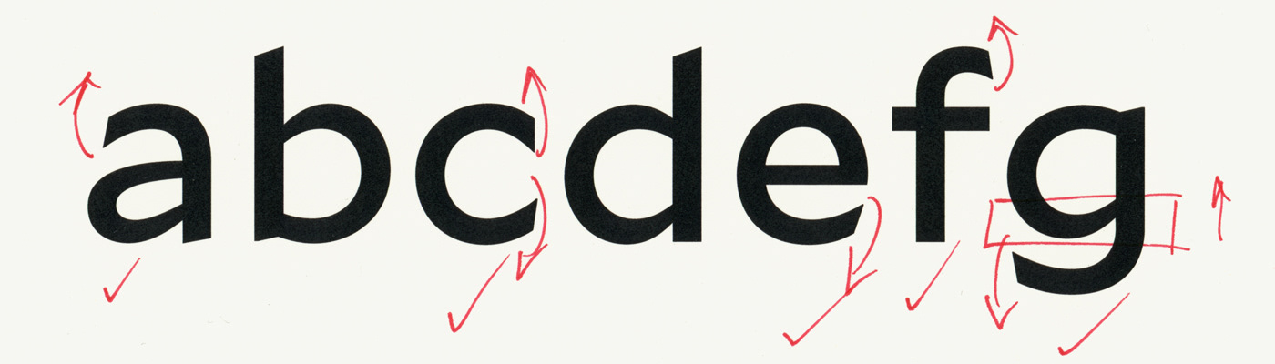

Proofs and commentary during development
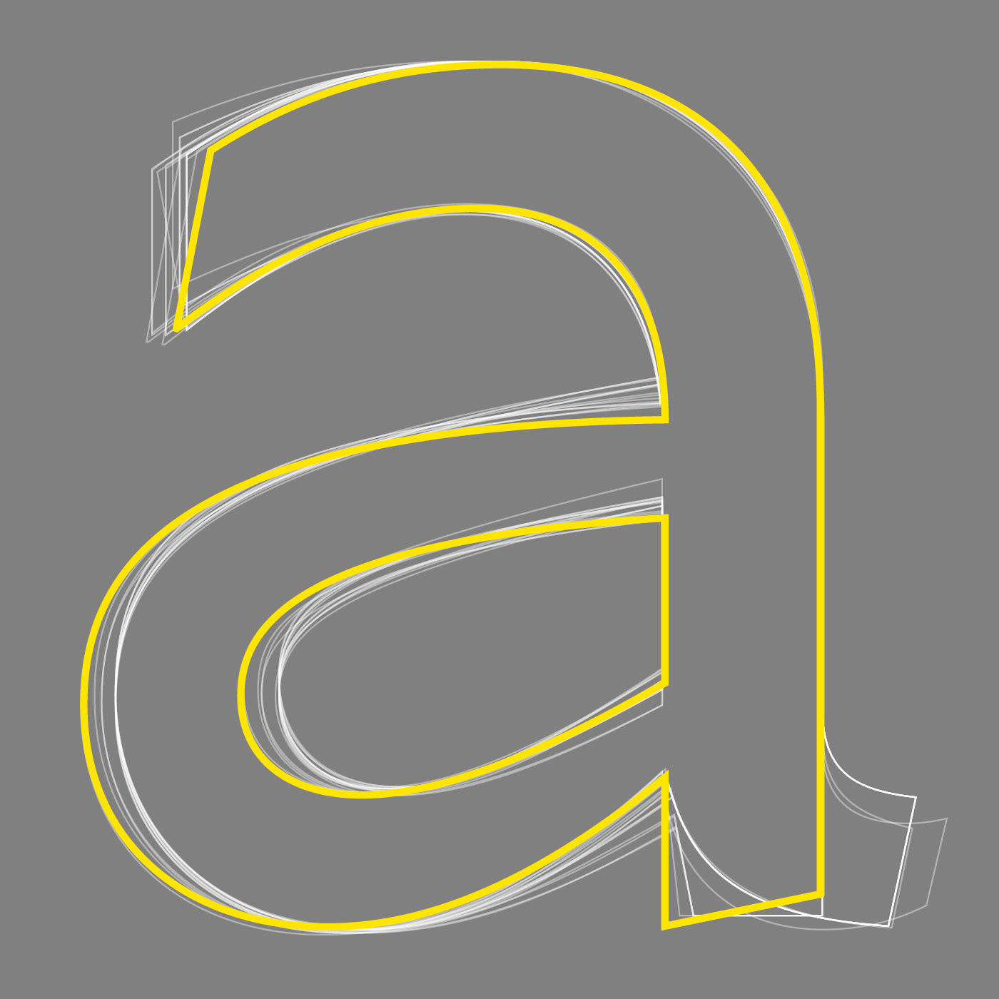


All versions of lowercase “a” from first draft to final release


Mallory MicroPlus, closeup of screen display

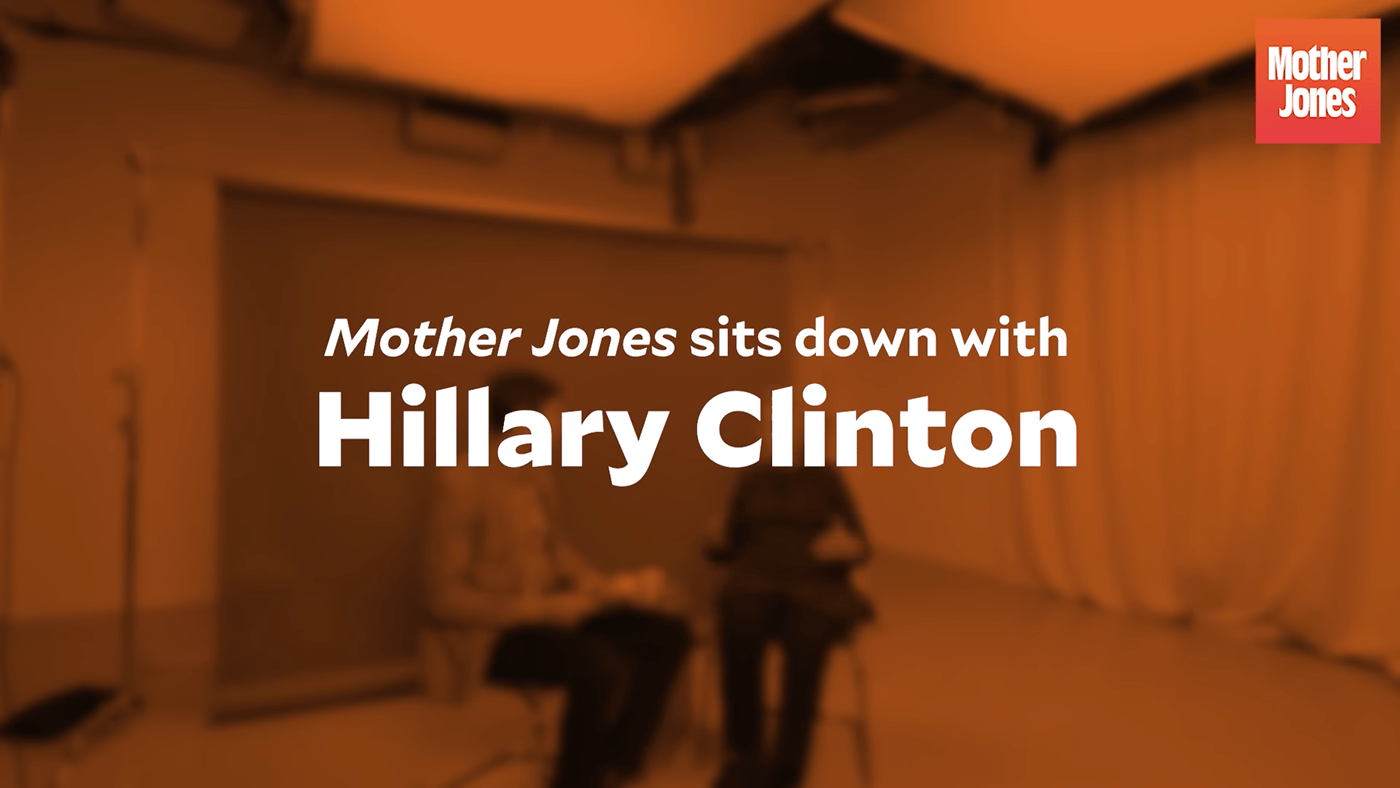
Mallory in use: Mother Jones video series
