
Established in 2018, The Mill (officially Dimension Mill Inc.) is a coworking and business incubator space in Bloomington, IN, operating as a nonprofit organization. Its mission is to “build the infrastructure that technology and innovation entrepreneurs need to be successful” and prompt them to “launch and accelerate companies to create jobs and increase wages.” The Mill is housed in a stunning 19,000-square-foot, 103-year-old renovated building that used to be part of the Showers Brothers Company’s massive plant and now accommodates dozens of members on temporary and dedicated desks, private offices, and shared conference rooms as well as opening its doors to the public for community-building, skills-focused seminars, and educational and member-driven events every month. We started working on their identity at the start of 2018 when the building was still being gutted and were thrilled to have been part of this effort leading to The Mill’s launch in October 2018.
Logo concept.
The most distinctive feature of the building is its sawtooth roof that not only looks bad-ass from the outside but is a source of beautiful natural light on the inside. The building has eight sawtooth roof segments and, as luck would have it, so does the name “The Mill” (if you count the space).
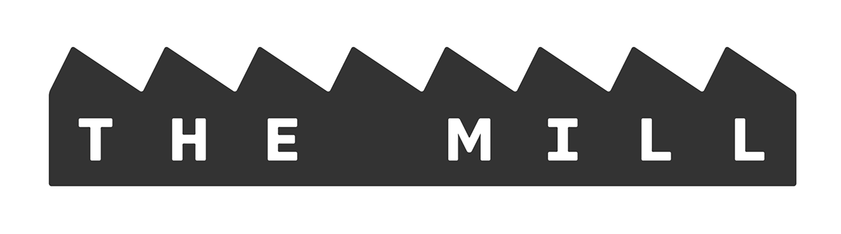
Logo, primary.
The logo serves to distinguish The Mill from other co-working spaces around the country by focusing on its space and work ethic: The shape of the logo is a simplified abstraction of their iconic building and the eight sawtooth partitions on its roof that equal the eight characters in their name while the typography is bold, industrious, and determined, like the many innovators, remote workers, entrepreneurs, and creators that occupy The Mill.
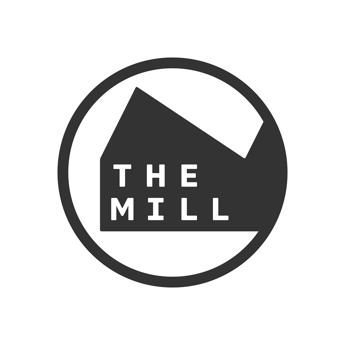
Logo, secondary.
Given the wide length of the primary logo we created a secondary logo to use as social media avatars and in other instances where horizontal real estate is limited. The secondary logo zooms in on one of the roof segments — while implying that the building continues to the right — and rearranges the wordmark in a stacked configuration.
Primary to secondary logo animation.

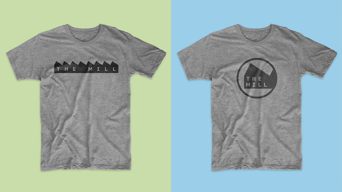
Alternates.
For added flexibility we also created building-less logos to use in special circumstances — like the signs on the exterior of the building (shown way below) where having the building shape is redundant. Additionally, these variations can be amended with “Bloomington, IN” for cases where communications are targeted to people outside the city. In another stroke of character-count luck, we were able to fit every other character of the city right in between each of the characters of the wordmark.
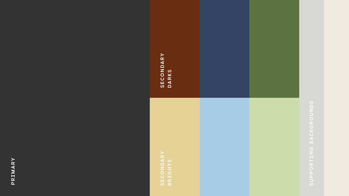
Color palette.
The color palette is extracted from the furniture and fixtures found inside The Mill — here is an example. These provide a calm but confident palette that complements pictures of the exterior and interior of the building. While The Mill’s focus is on tech and entrepreneurial activity, it’s still an organization in a small city in the Midwest so a more modest, less loud color palette felt right.
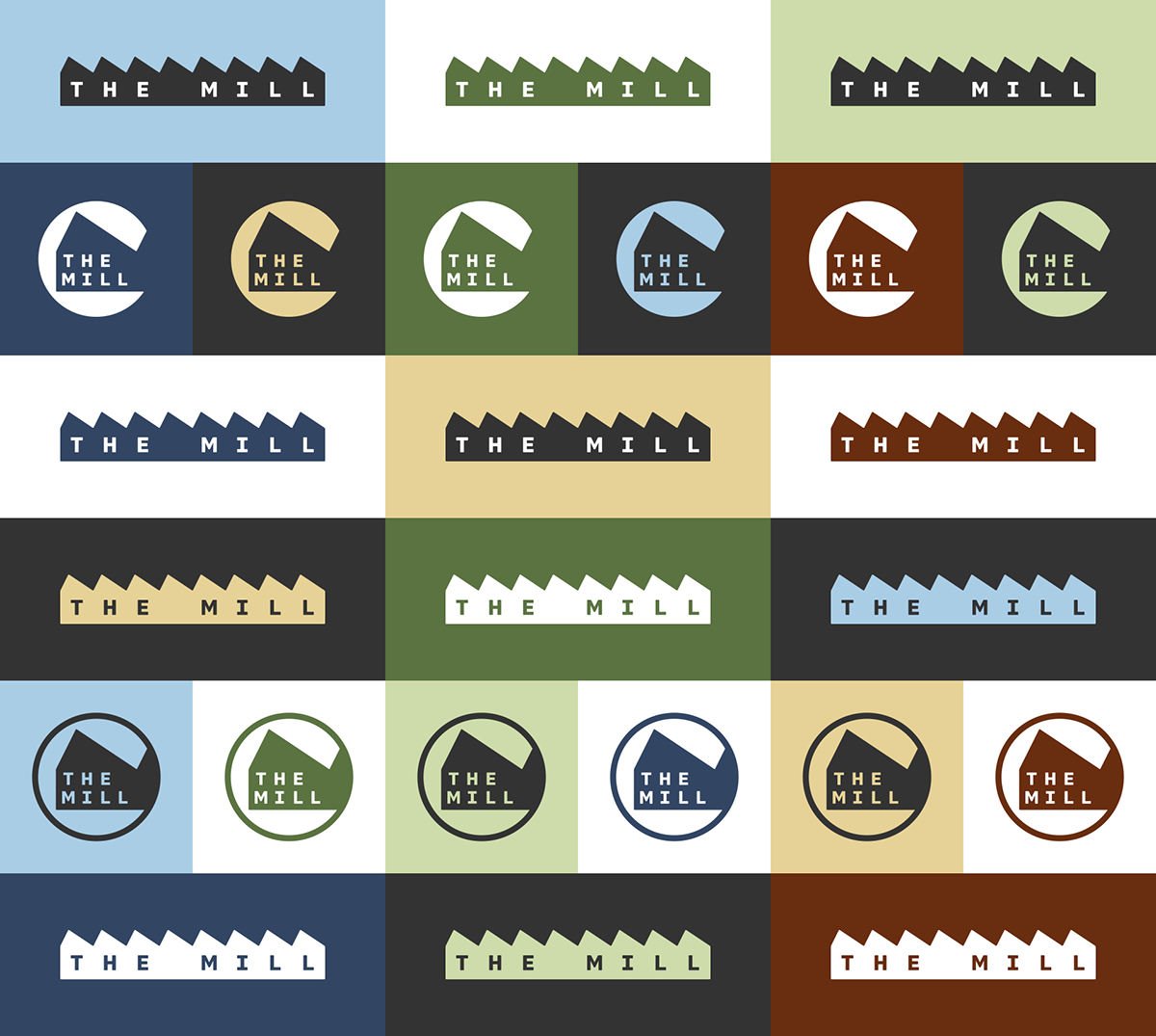
Logo color variations.

“Cover” logo.
The last variation of the logo we created is one made specifically for “cover” treatments that can make the logo span edge to edge in a layout and allows an image or color to still be visible through a stroked treatment of the building shape.
"Cover" logo.
Pattern.
A simple pattern allows the name to be read horizontally and vertically.


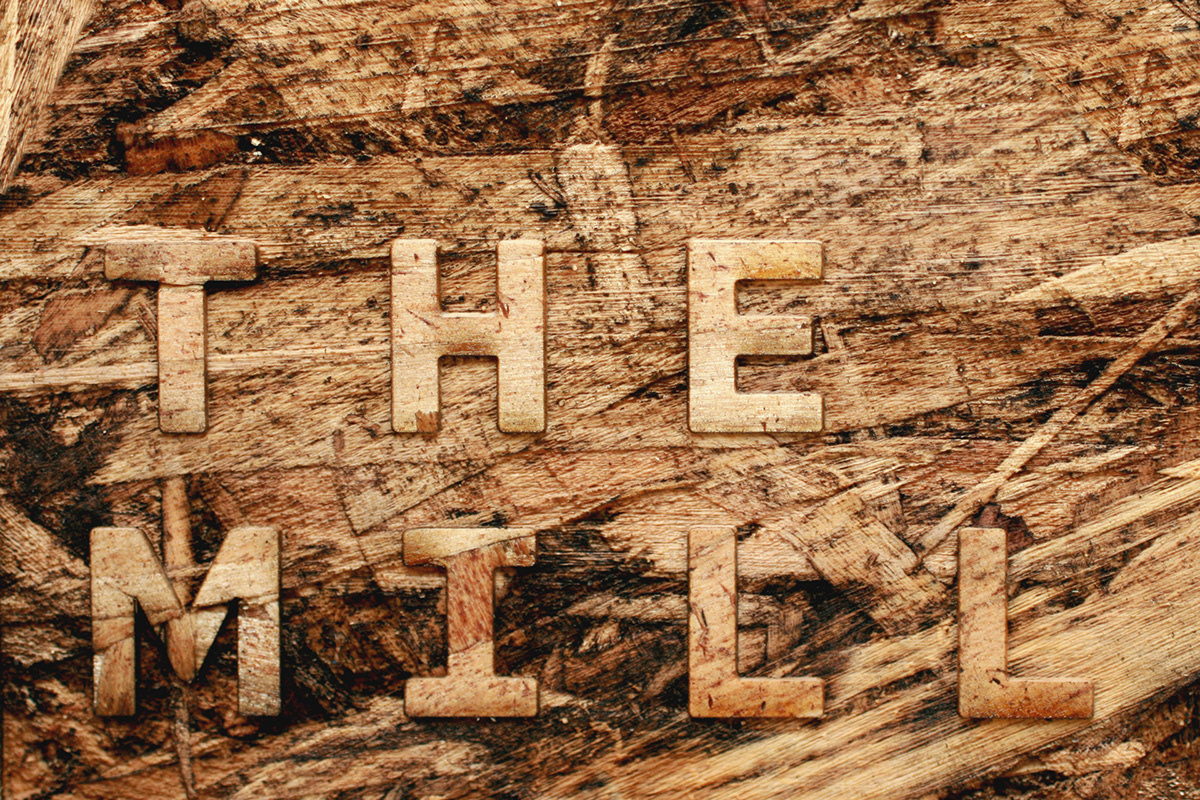
Custom font.
Based on the premise of the primary logo — of one letter per roof segment — we created a custom font that follows the same monospace approach and provides The Mill with a simple and easy-to-implement identity element to establish their own visual language. We modified DDC Hardware to have wider characters and rounded corners throughout while changing up some characters to better fit the design. The custom font has a limited glyph inventory but it does have some OpenType magic — provided by Type Supply — that allows the roof segments to flow into each other when characters are inside a word but is then able to round out the building shape in the outer characters at the start and end of each line.
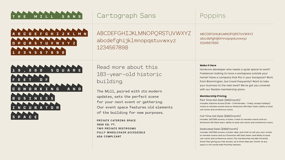
Typography.
The custom font is complemented by Cartograph Sans — used in its light weights for headlines — to add a bit of “tech” flavor and Poppins as the body font. Together, and in unison with the variety of logos, The Mill can mix and match elements in different ways in their communications.

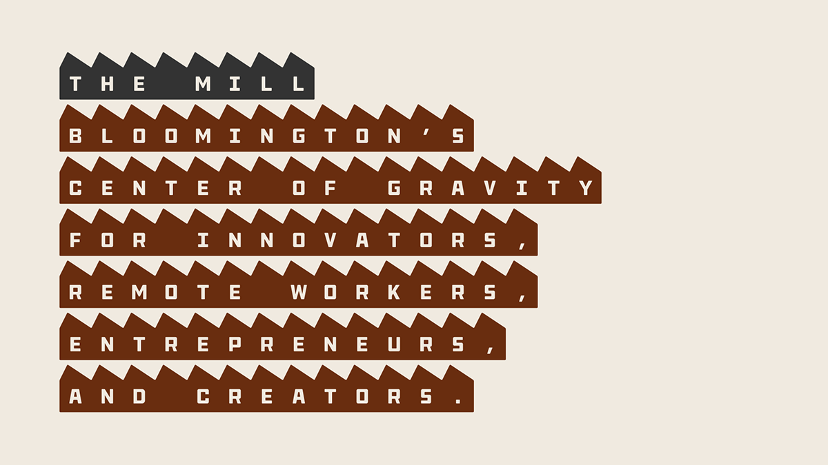
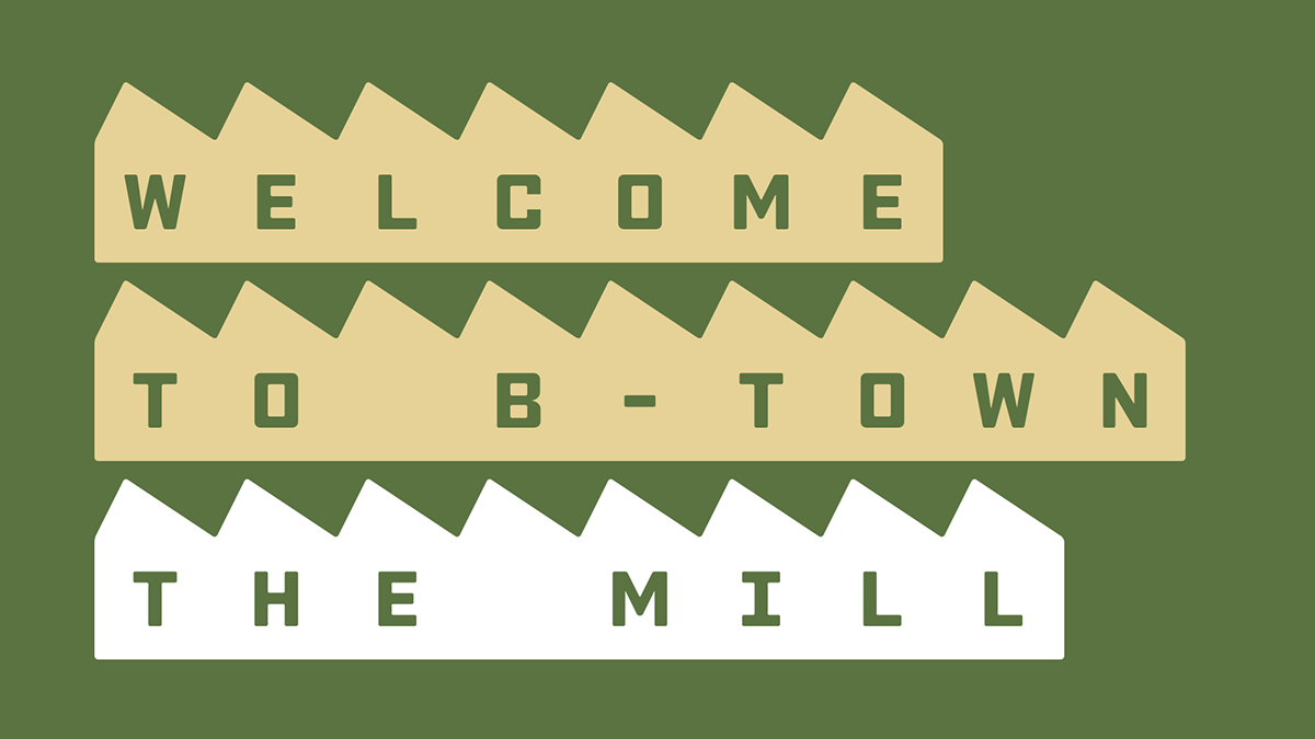
Variations of three different messages.

How their Instagram account would look if every single post was on brand.

Website home page and sample interior page, as originally designed… live version, not built out by us, is a little different.
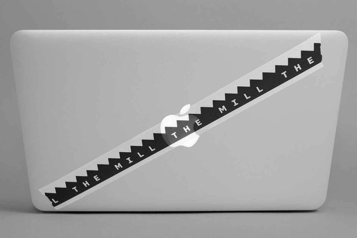
Infinity tape.
In the first round of logo explorations that we presented to The Mill we included this render that showed the idea of making rolls of tape that would have an endless loop of the logo. To be honest, we weren’t sure exactly at the time how we would produce it, but we were all pretty excited by the possibility. Their marketing director landed on the approach of producing it as washi tape and it turned out quite nice.


More tape.

Traditional stickers.
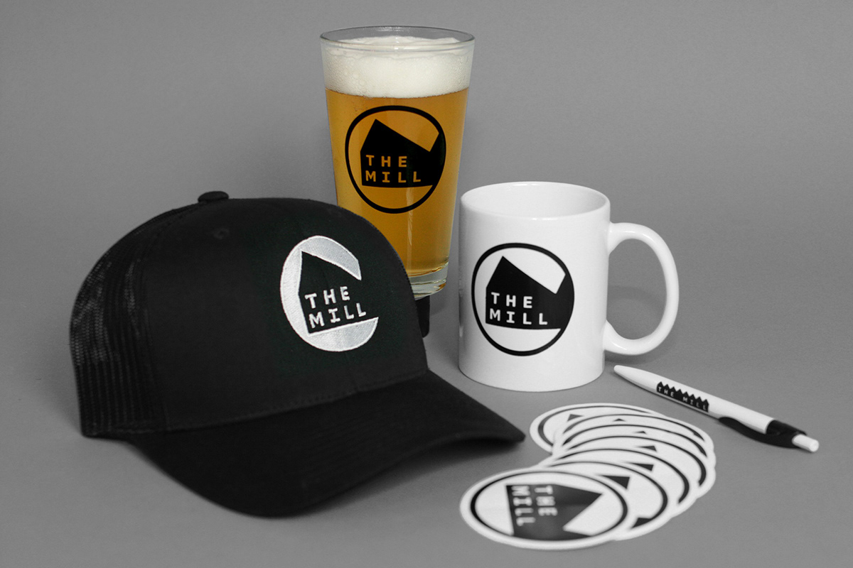
Swag.
They also produced some fun swag on their own (above) while we played around with some laser-cutting and etching options (below).


Fun with laser-cutting and etching.
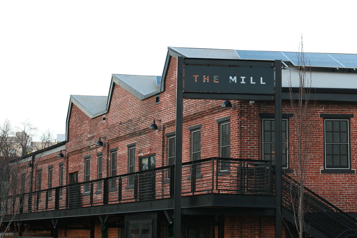

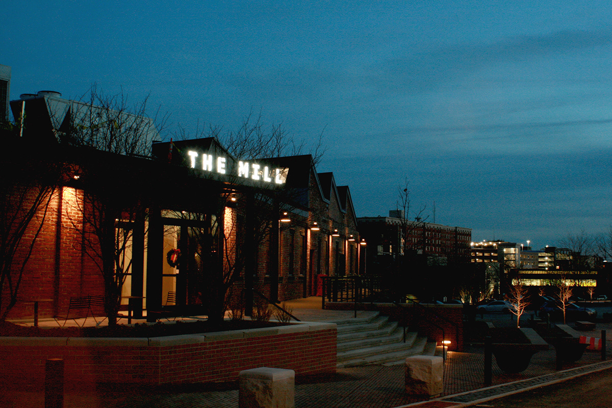

Exterior signs.
The main entrance sign (directly above) was fairly close (in spirit) to what we had presented in the first round of explorations but since we don’t really have much experience in signage it wasn’t quite feasible as presented. Working with Indianapolis, IN-based Blackline Studio — who were in charge of the building’s renovation and design — we arrived at a solution that moved the wordmark to the top of the beam which allowed for a bigger-size sign and more flexibility to add lighting. The hollow sign had also been pre-imagined by Blackline Studio and we just placed the logo in the allotted structure.

Interiors. Click here for bigger view.

Interior signage.
We didn’t have anything to do with the interiors — other than sizing the office number decals — but it’s an awesome space to look at… and, hey, these photos might make you consider moving to Bloomington, IN, and work from The Mill.

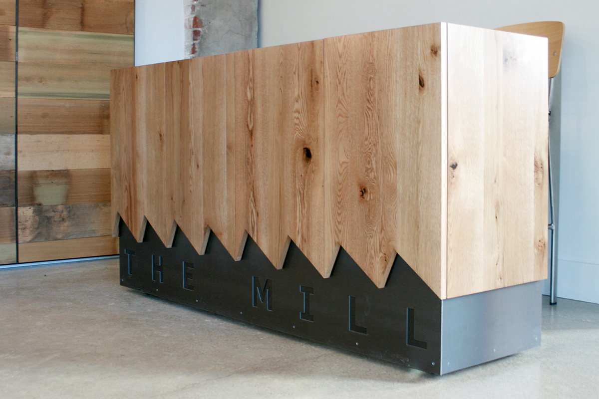
Kick-ass reception desk, designed and built by Nick Allman.
One surprise when we attended the ribbon-cutting ceremony was this fantastic desk designed and built by Indy-based Nick Allman that makes great use of materials to shape the logo in a different way.
In the end, our hope is that we have provided The Mill with a strong set of recognizable logos and a flexible set of identity elements to start building a consistent yet varied tone of voice that will help them build a brand as sturdy, useful, and representative of their own space.

