
The New Jersey Performing Arts Center, or NJPAC, in Newark, is one of the largest and most diverse presenters of performing arts in the country. Pentagram has designed a brand identity for the cultural institution that celebrates its vibrancy. Built around a custom typeface and bold color, the identity highlights the remarkable range of programming at the Arts Center and provides a cohesive visual language for promotion.
Pentagram worked closely with NJPAC leadership on the project, which coincides with the Arts Center’s 20th anniversary season. The programming at NJPAC encompasses everything from classical, jazz, rock, pop, urban, and world music to dance, musicals, comedy and poetry and family programs. Since opening in 1997, it has become an important catalyst for economic development in downtown Newark. The Arts Center needed a flexible system that would support all of its initiatives and celebrate its diversity while promoting a cohesive institutional image.
“As the presenter of 400 events each season in theaters on our campus in Newark, as well as the provider of 300 arts education, community and civic engagement programs in schools, libraries and community centers throughout New Jersey, and the producer of multiple touring productions that will reach 50 cities across America annually, NJPAC needed a brand identity that seamlessly knit together the diversity, excitement and artistic excellence inherent in all we do,” says John Schreiber, NJPAC President and CEO.
“The Arts Center's new look is unique, bold, engaging, inviting and fun. We can't wait to bring it to life in a thousand different ways now and in the seasons to come.”
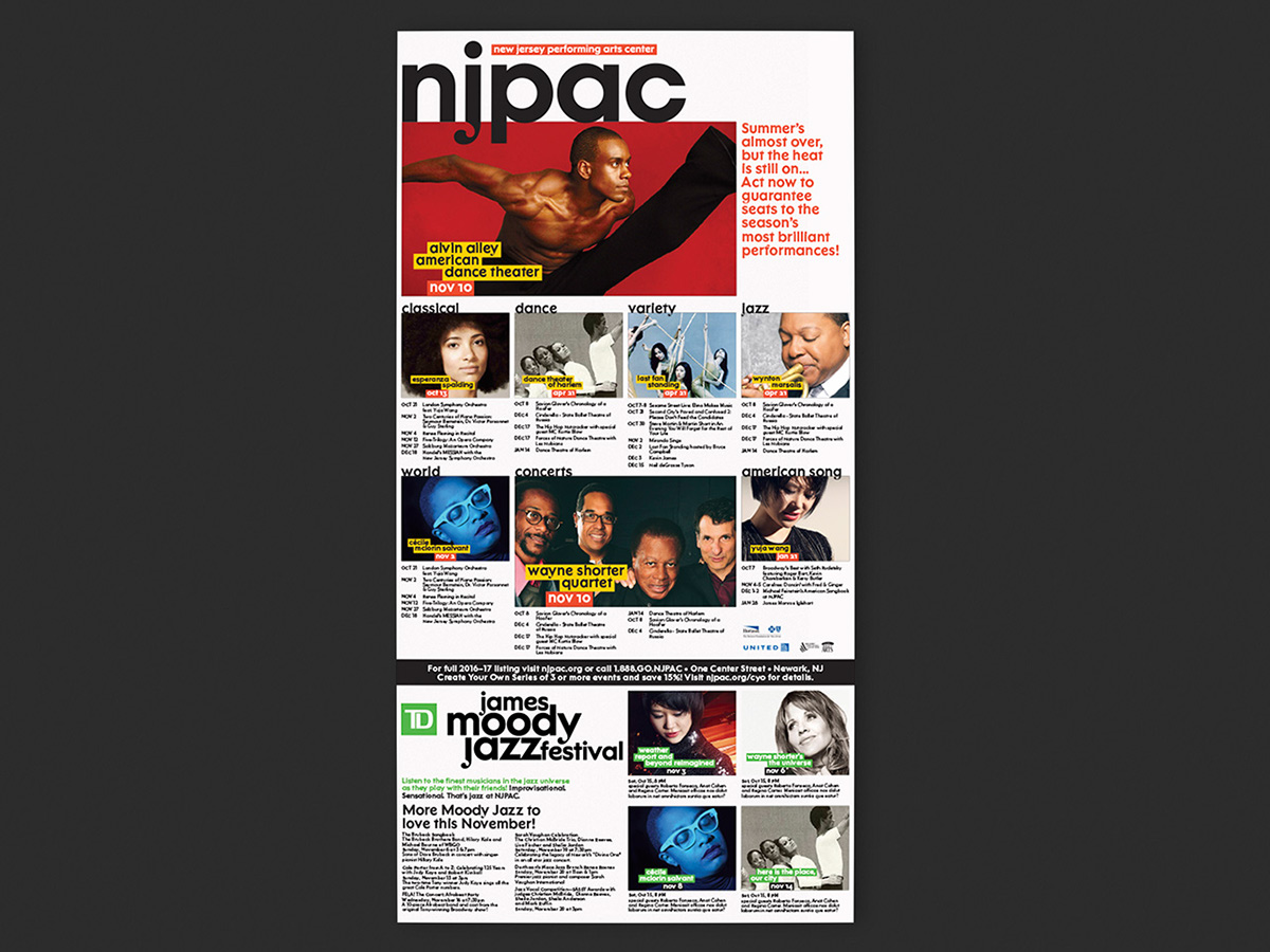
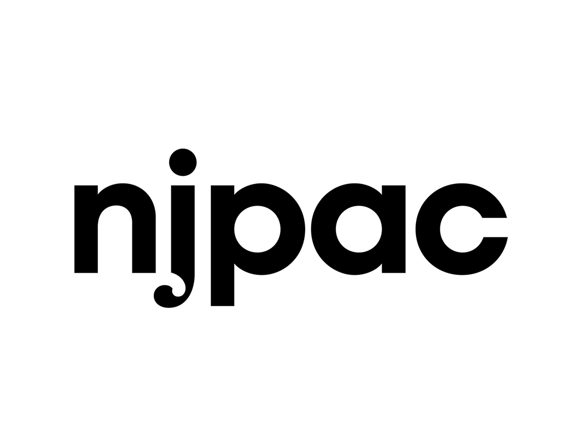
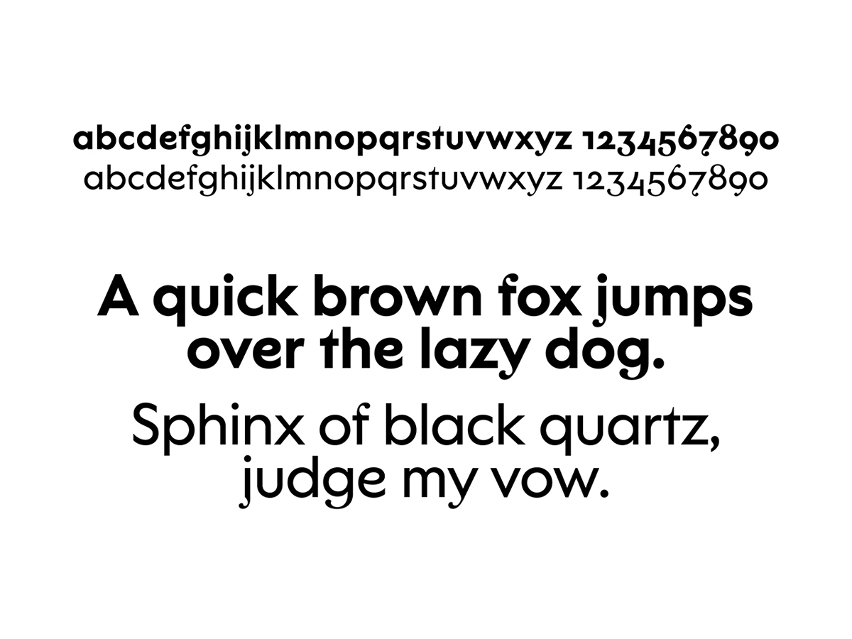
The designers developed a custom proprietary typeface called NJPAC Sans, exclusive to the Arts Center. The font is based on ARS Novelty, designed by Angus Shamal, which blends an elegant high contrast serif and a geometric monoline sans. Working with the Pentagram team, Shamal expanded on this for the NJPAC typeface, drawing new letters, tweaking existing letterforms, and developing a completely new book weight, along with italics for each weight. The classic-contemporary hybrid is a nod to NJPAC’s previous logo, which mixed serif and sans serif typography, and suggests the range of experiences at NJPAC. The NJPAC logotype appears in all lowercase, to make it friendly and accessible.
The defining feature of NJPAC Sans is its distinctive swashes, which add quirkiness and a defining signature characteristic to the branding and suggest the multitude of programs. There are several different swash alternates for certain letters, as seen in the “j” in the logotype. In applications, the typography and its multiple letterforms appears dynamic and dramatic, transforming across fields of type. The approach gives the typeface a unique look that doesn’t really exist in any other geometric sans serif fonts. The swash alternates are used for display copy and titling.

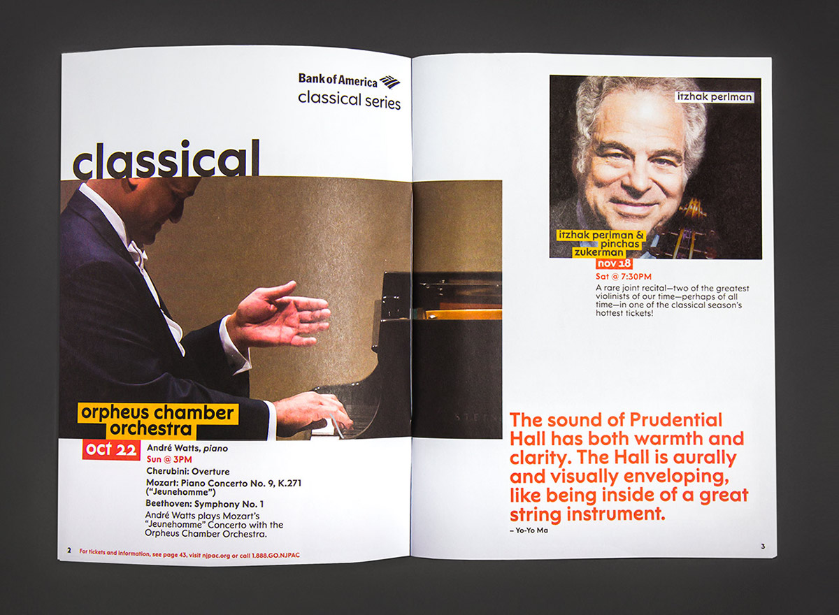


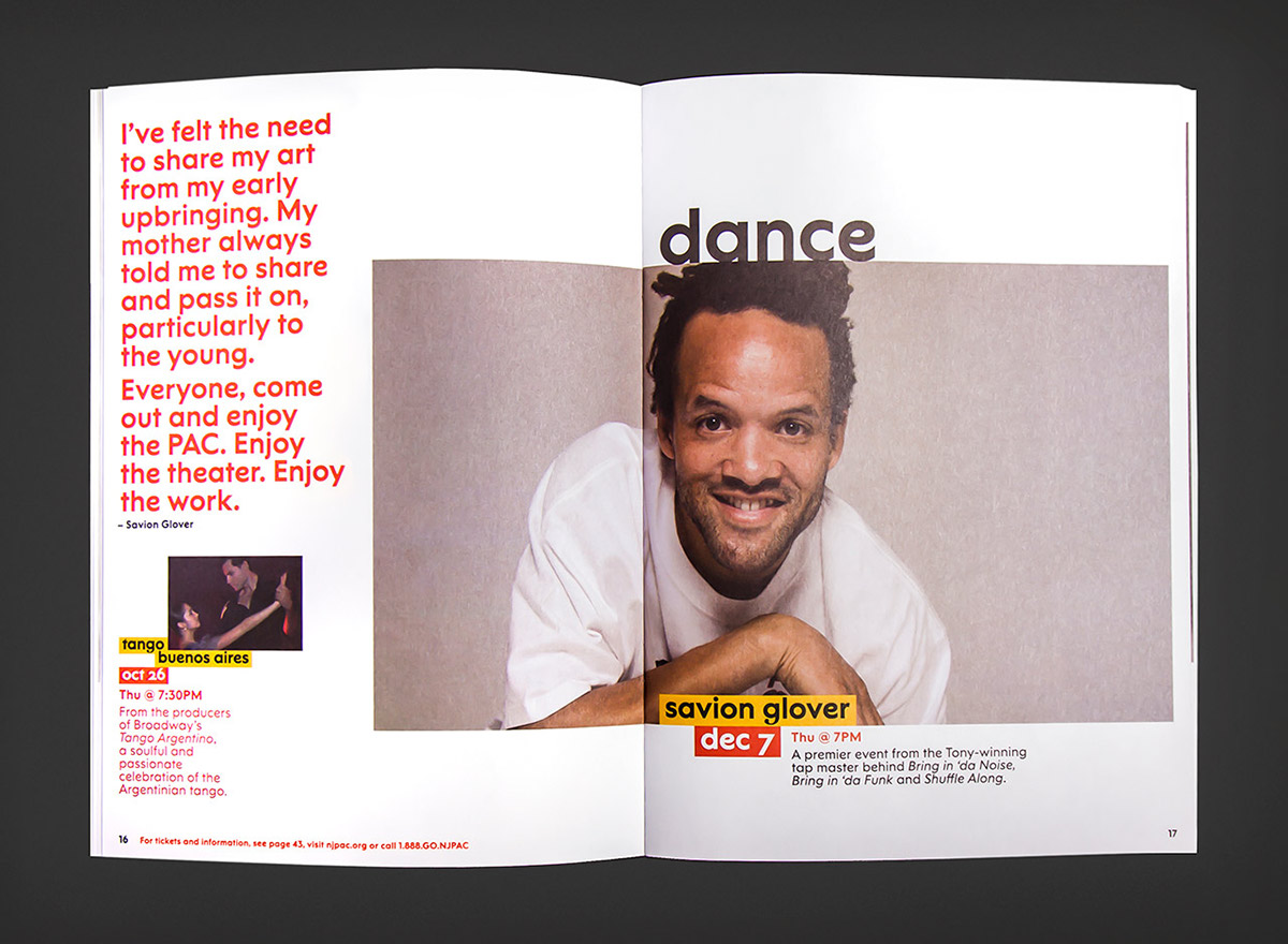


The type is complemented by a graphic treatment that isolates titles and secondary typography in staggered color blocks. This provides a flexible system that helps highlight, organize and unify information. The blocks can also be used in lockups to create sub-brands for various programs, departments and initiatives. Endlessly flexible, the visual language can be adapted to different layouts, and lends the graphics a sense of movement and play that perform in space. The approach accommodates different types of imagery—color or black-and-white photography that is available or commissioned for different artists and performances. The identity provides a framework where the individual programs and performances can shine within the institution.
A vibrant color palette adds dynamism to the stagger of the boxed titles. The bright orange and yellows stand apart from New York identities, which predominately rely on stark black and white.