Great Eastern Energy
Identity System
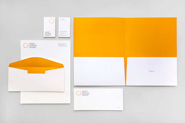
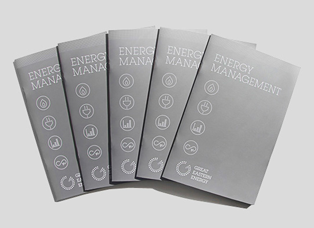
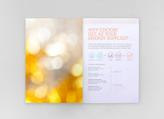
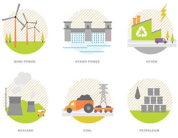
Natasha Jen and her team designed a new identity for Great eastern Energy, one of the largest alternative suppliers of natural gas and electricity in New York, New Jersey and Massachusetts. The new logo is composed of dots in bright shades of orange and yellow, the new logo combines the shape of the letter ''G'' with the circular form of an energy meter. The dots are arranged in a pattern of alternating colors, visually activating the logo to convey the idea of energy production. An animated version of the logo on the website rotates the two circles like the turbines in a power generator. The symbol is accompanied by a wordmark set in ITC Lubalin Graph. The new identity positions the company as a unique and innovative energy provider. Modern, friendly and accessible, the identity is part of a comprehensive program of graphics we created for GEE that helps educate consumers about energy and design their own solutions to save energy. Since the launch of the identity this winter, the number of consumers who have made the switch to GEE has increased by an extraordinary 500 percent.