

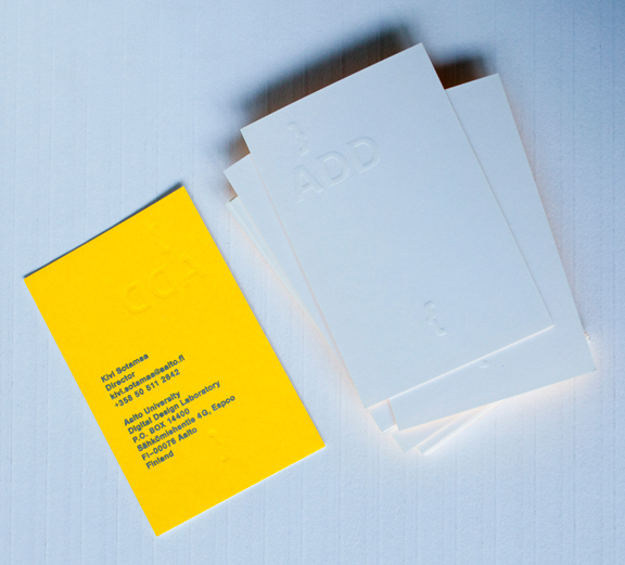
ADDLAB business cards
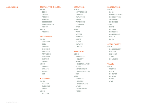
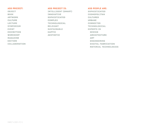
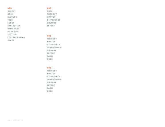
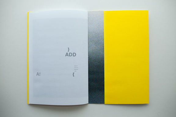
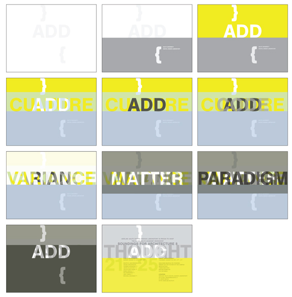
The brand positioning for ADDLAB focused on the concept of the name ADD as ‘added value’ in design. We created lists of appropriate words to use throughout their communications.

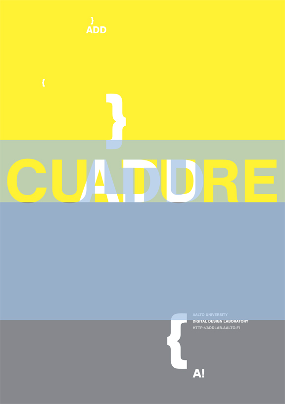
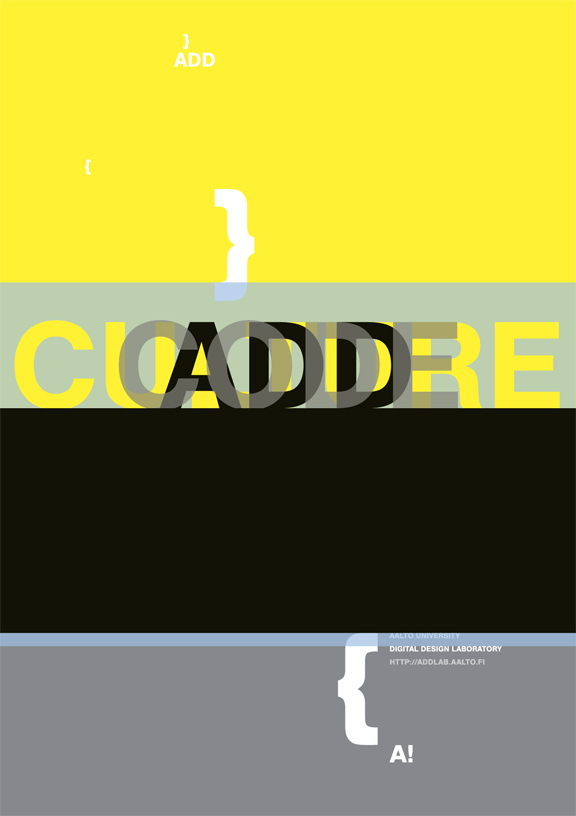
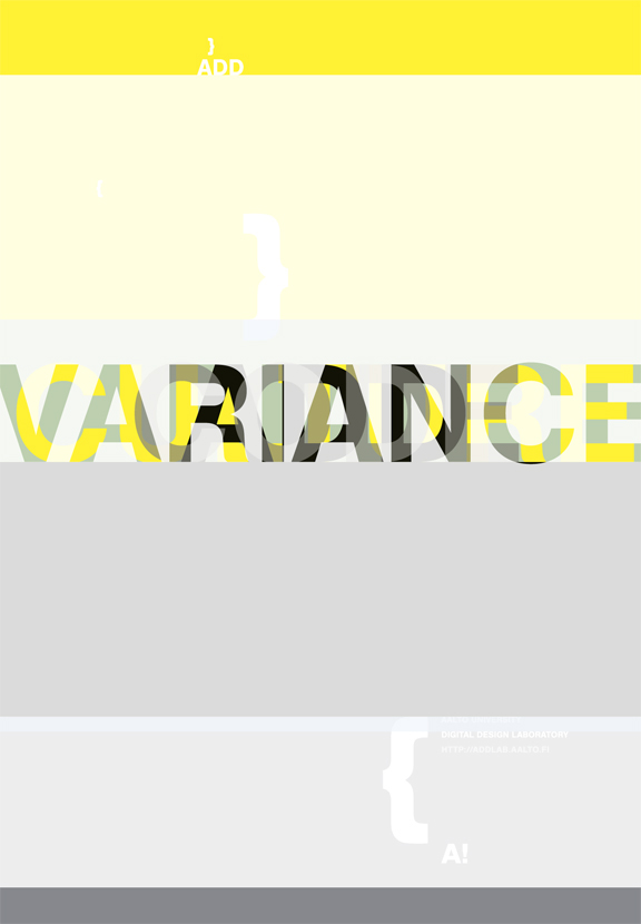
ADDLAB posters

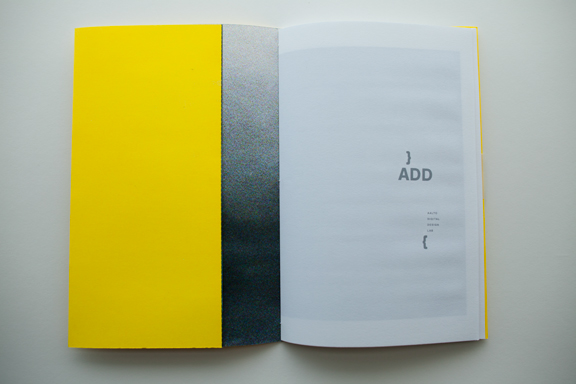


ADDLAB capabilities brochure cover. The brochure was designed so the client could print it at their offices. It is standard A4 size, folded in half, sewn binding, and the cover is one of the brand posters cut to size. This provisional solution was appropriate to start with, as their capabilities were growing rapidly.
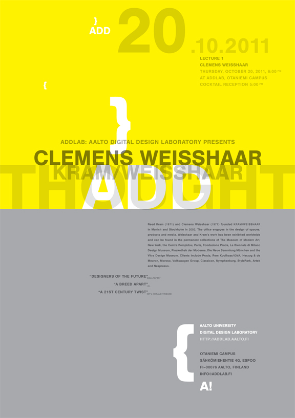

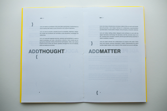
ADDLAB lecture poster. For the lecture and workshop posters, we recommended to use the words ‘ADD THOUGHT’ as a constant brand element.
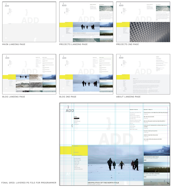
RMS designed two websites for ADDLAB: one, a temporary site culminating on the announcement of the workshop; and, two, the final website.
Comprehensive Brand Identity Design for ADDLAB, Helsinki, Finland.
RESEARCH + FINDINGS:
Rebeca Méndez Studio conducted research during the months of June and July. The findings were delivered and discussed in person in multiple meetings and conversations with client at the end of July, 2011.
POSITIONING + IDEATION:
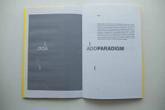
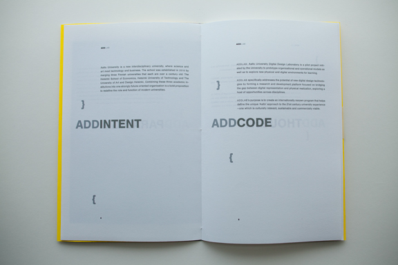
Prior to our involvement, Aalto Digital Design Lab was referred to, in speech and writing, as the acronym ‘A. D. D.’ Our recommendation was to move the name away from ‘A. D. D.’, which points towards ‘Attention Deficit Disorder’ and to adopt the new positioning of ‘ADD’ as in ‘addition, additional’ focusing on the ‘Added Value’ design offers. As a tangible result, a new name:ADDLAB, selected ‘ADD’ words, and a positioning text which became the essence of the capabilities brochure copy.
DESIGN:
GRAPHIC ELEMENTS: logotype and logomark (symbol)
The logotype and logomark (curly parenthesis) designed to conform to Aalto University Graphic Identity Standards, which calls for Nimbus as their font.
The logotype and logomark (curly parenthesis) designed to conform to Aalto University Graphic Identity Standards, which calls for Nimbus as their font.
The logotype is composed of the capital letter ‘A’ and an analphabetic character. For ADDLAB we selected the curly parenthesis, taken from digital ‘code’ script. The curly parenthesis are open towards the space outside the space of the logotype, in a sense, ad- dressing everything, all that exists.
GRAPHIC ELEMENTS: color palette and graphic standards
The color palette was designed to accommodate offset printed materials (Pantone and CMYK), digital/web (hexadecimal) and broadcast (RGB) color palettes.
The color palette was designed to accommodate offset printed materials (Pantone and CMYK), digital/web (hexadecimal) and broadcast (RGB) color palettes.

