Old (bottom) and new (top) issues of Creativity.
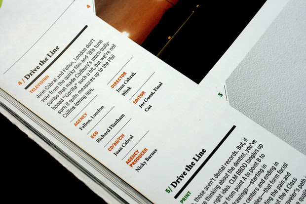
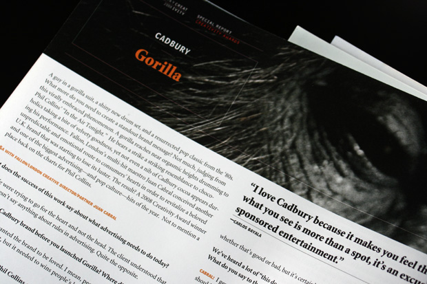
The redesign maintains the eclectic typographic combination of Matthew Carter’s Bell Centennial, Robert Slimbach’s Minion, and a customized version of John Scheppler’s Orator, but has shifted the balance to feature bigger and bolder headlines in Minion and using the other two typefaces for details and emphasis. We also introduced a new format to present the detailed credits that each project requires, while allowing the visuals to appear bigger, and even meaner.
The inaugurual May 2008 issue was developed in-house by Editor Teressa Iezzi and Art Director Jeanine Dunn, based on our prototype. Photographic details below and flat spreads underneath.