Norkart is a consultant and software provider of geographic information and municipal engineering. The company was established over 50 years ago and has shown good profitability based on professional trust and constructive dialogue with its customers. 390 municipalities currently use the company’s software. In 2011, more than 700 million map images were downloaded by the Norwegian people through the internet. Norkart has offices throughout Norway, in Sandvika, Bergen, Trondheim and Lillehammer.
Norkart commissioned Snøhetta to rebrand their visual identity, including re-naming and motion graphics. During a workshop together with the client we created a concept called “Staur” wich is Norwegian for a picket. Pickets were often used in fences for marking land territories and important landmarks. The graphical icon of the picket today is the map pin which is widely used in Norkarts softwares.
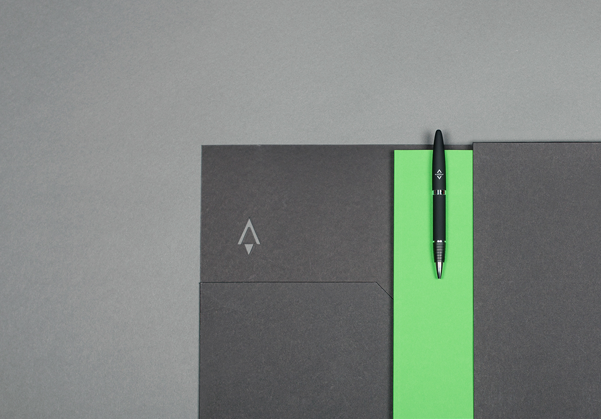
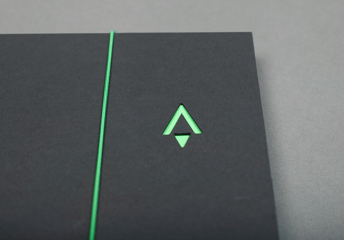
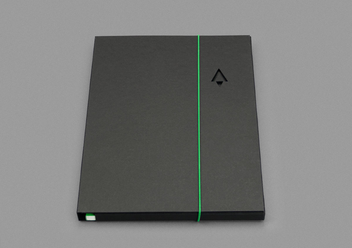
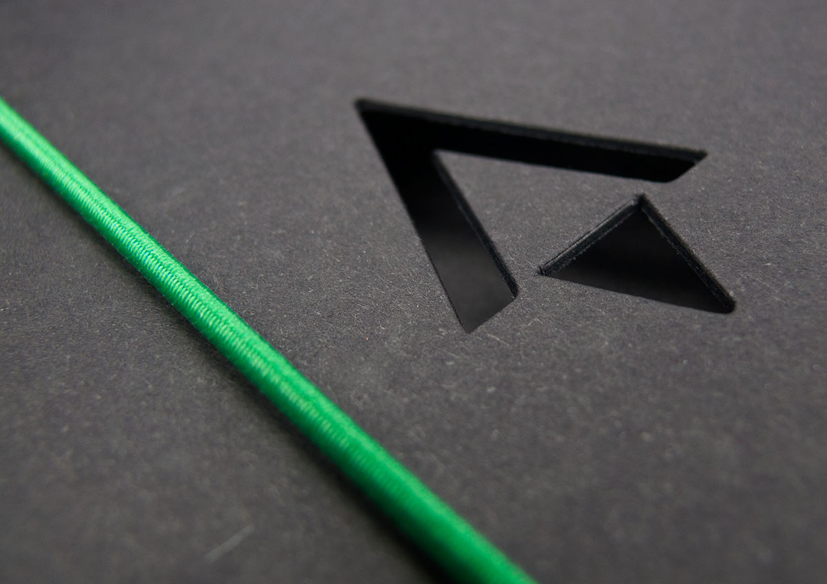
The picket is a shape with geographical symbolism represented in Norkart's logo. With a grounded downward picket symbolizing steadiness and the fundamental history and an upward picket standing for the future of Norkart as an innovative company.
Animation made by Babusjka

Workshop with Norkart at Snøhetta.
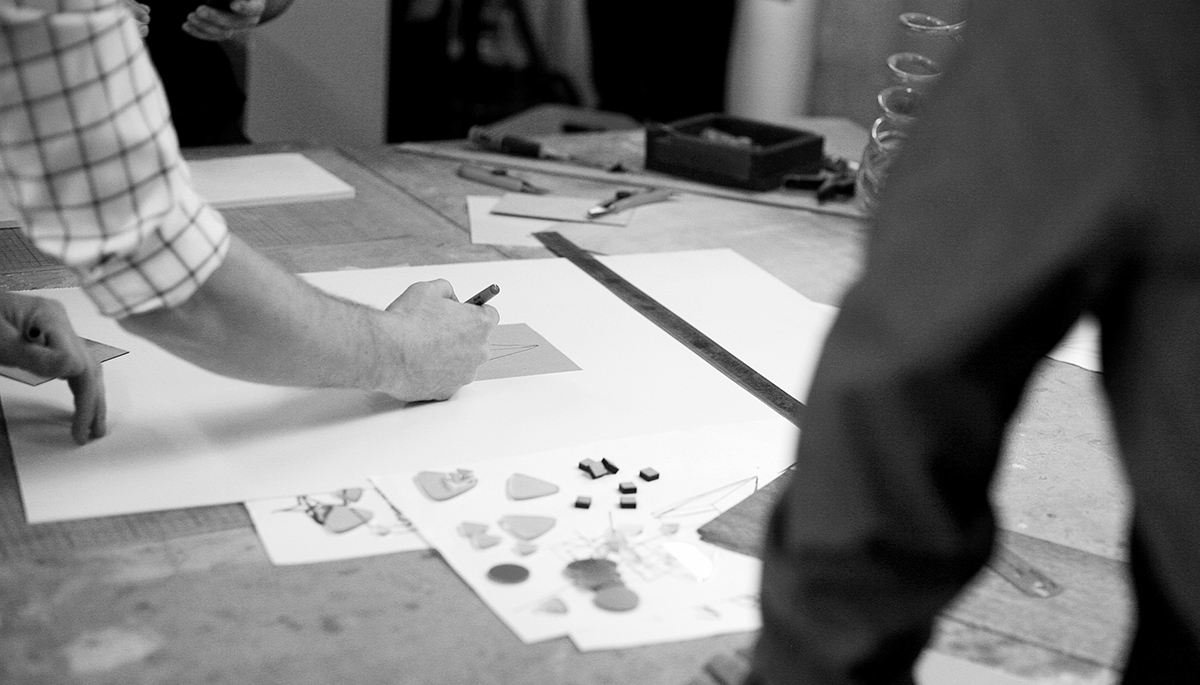
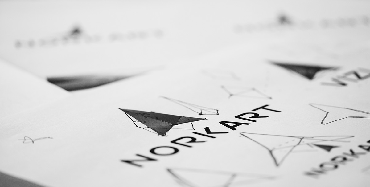
Prototyping concepts with the client.

The graphical icon of the picket today is the map pin which is widely used in Norkarts softwares.

Prototyping
Animation made by Svein Kvamme. Sound by Adam Karsen
©Göteborgstryckeriet
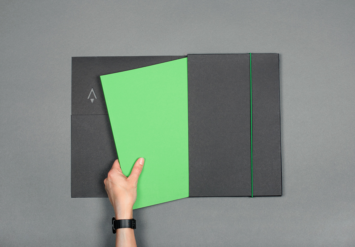
Document folder in massive black paper, for Norkart's Knowledge Program
© Göteborgstryckeriet
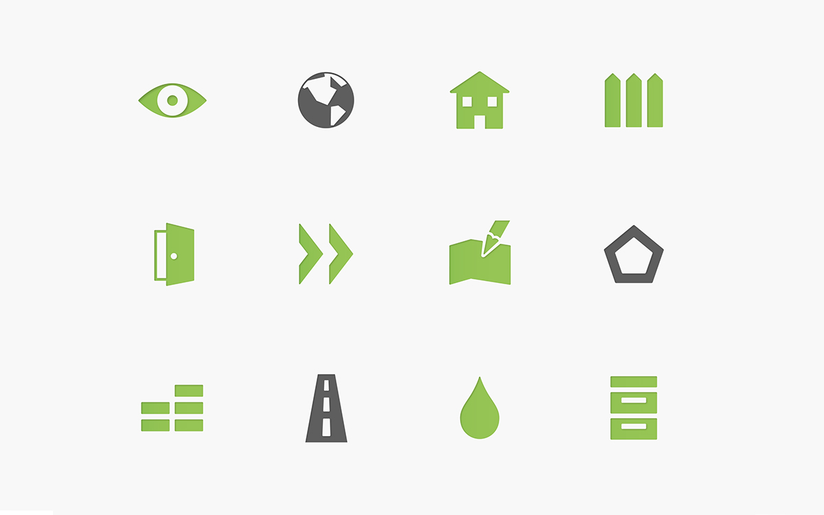
Icons for apps and software.