Telemark's visual identity is designed to help the many tourism operators and businesses in the county to appear unified and coherent. The purpose is to communicate the experience of Telemark as a modern and exciting destination, drawing to more visitors to spend valuable time in the county.
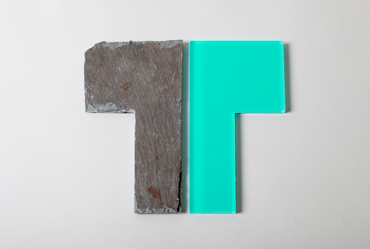
The overall idea of Telemark's visual identity is contrasts that complement and reinforce each other. The wet appears wetter in juxtaposition with the dry. The icy cold feels harsher in the face of the heat. The modern assumes a new perspective when paired with the traditional.
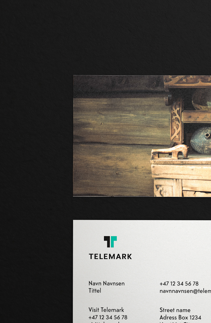
Location Telemark
Client Telemark County Council
Status Ongoing
Photographer Marcus Nyberg
Client Telemark County Council
Status Ongoing
Photographer Marcus Nyberg

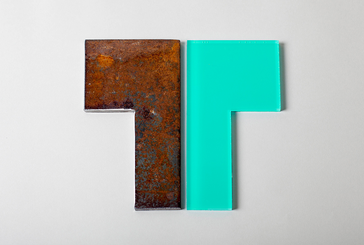
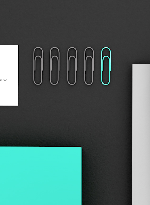
Materials that represents Telemarks contrast from ocean weathered copper to mountain stone are applied in physical variation of the logo symbol

Billboard
Example of half page print ad
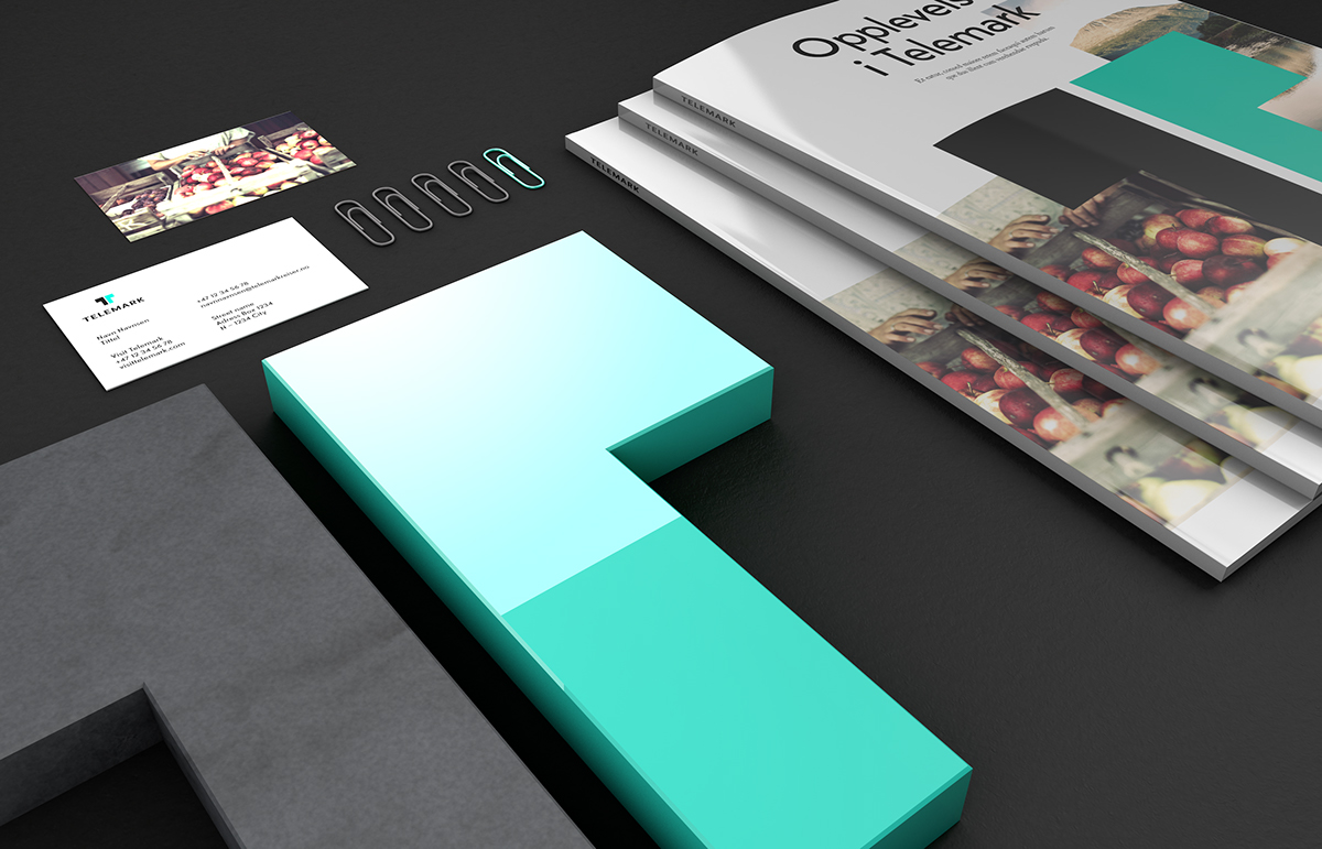
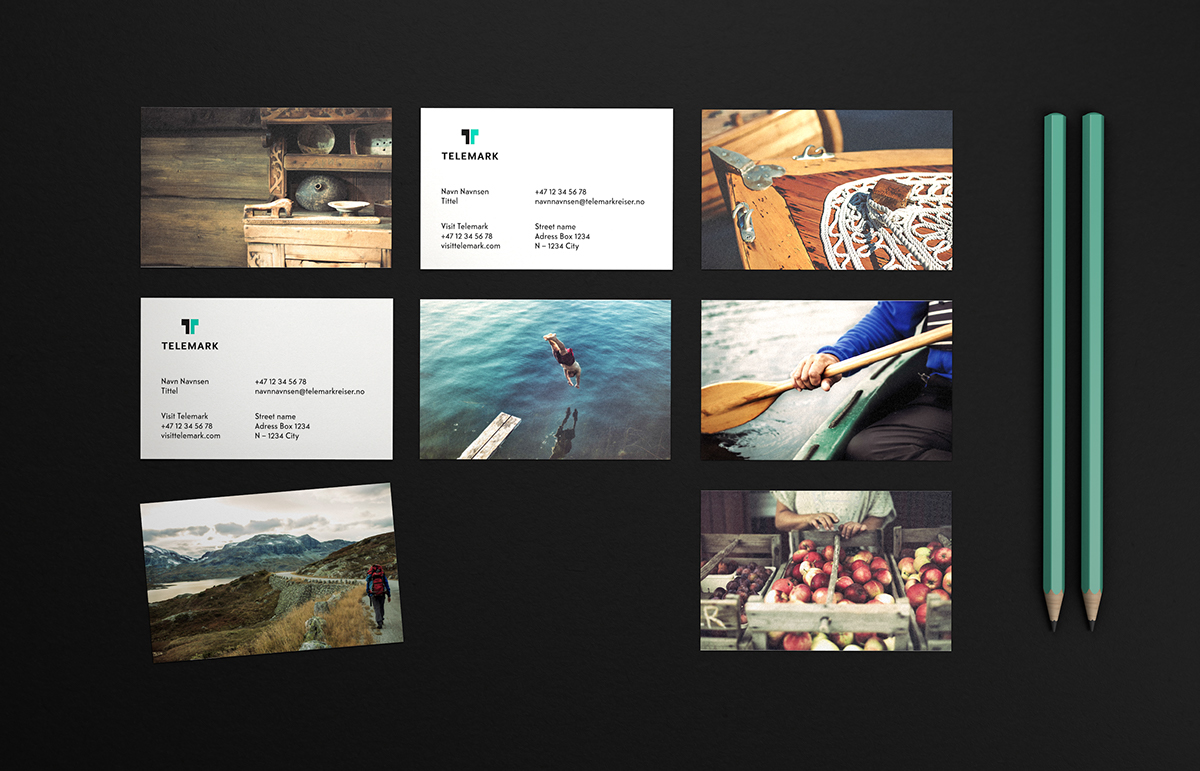
Collaterals and mobile media

Prototyping
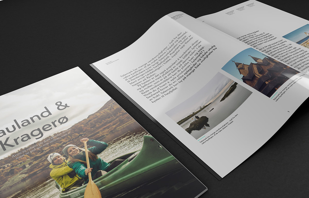
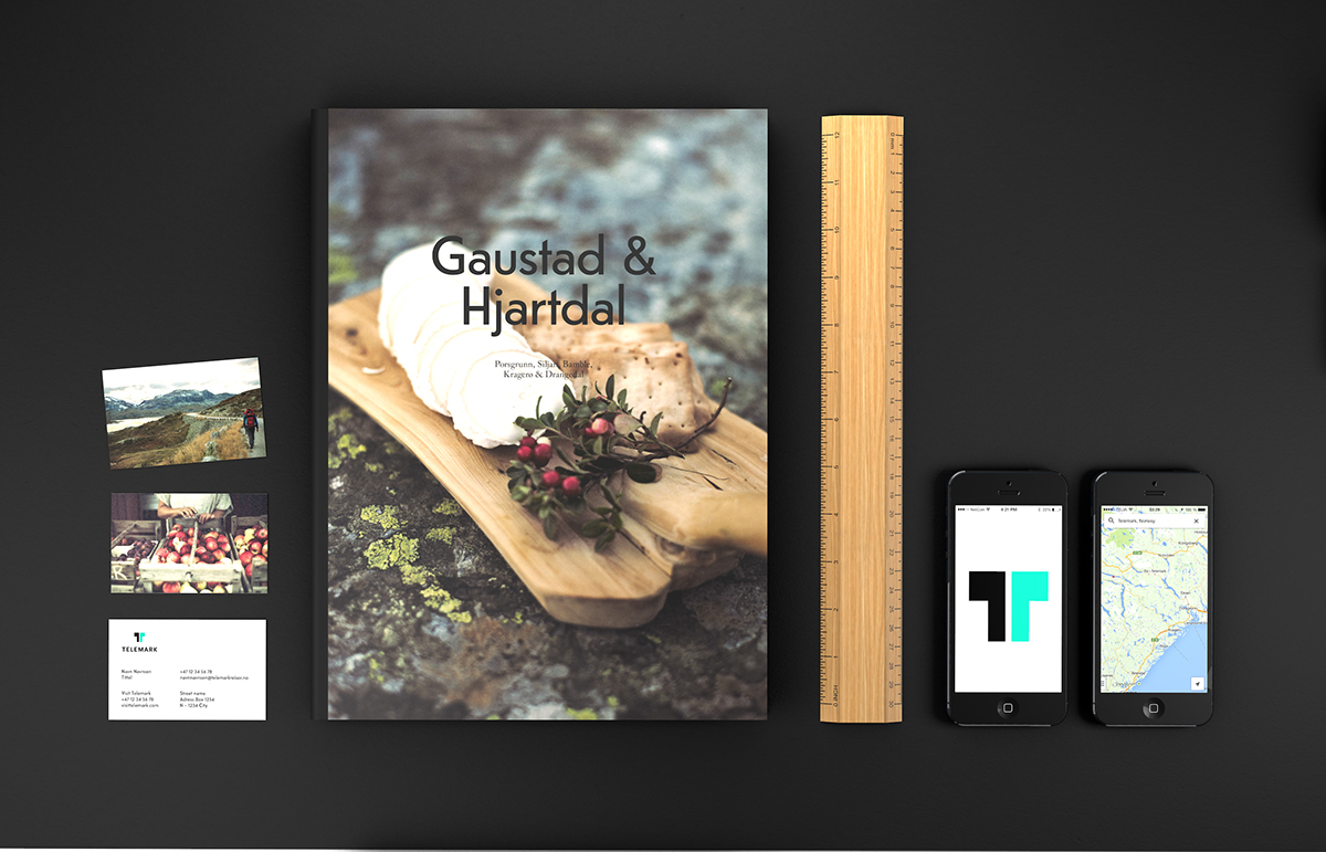
Brochure with Telemark activity and destination information
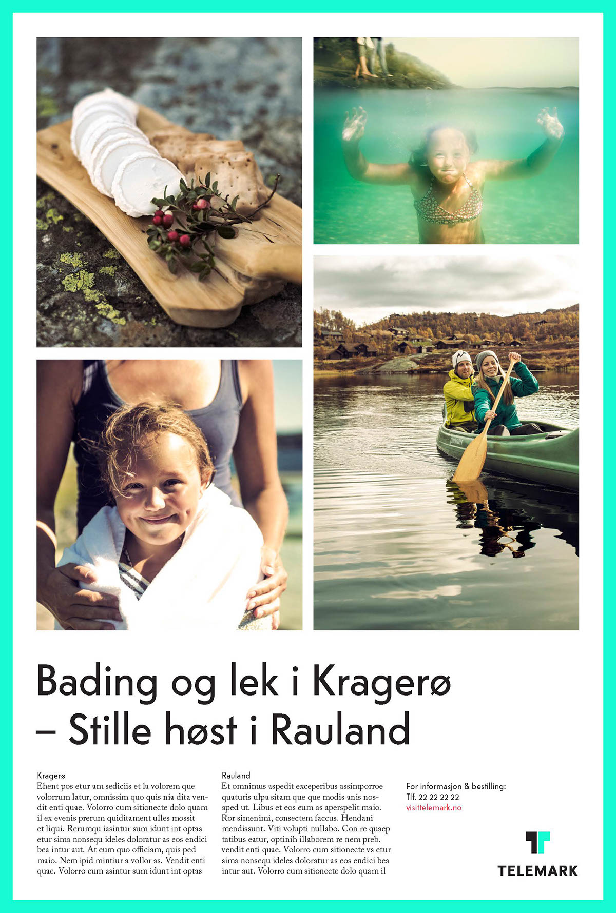
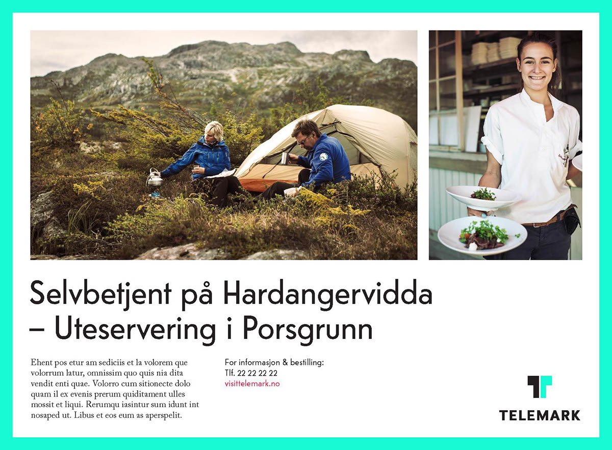
Example of full page print ad
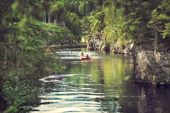
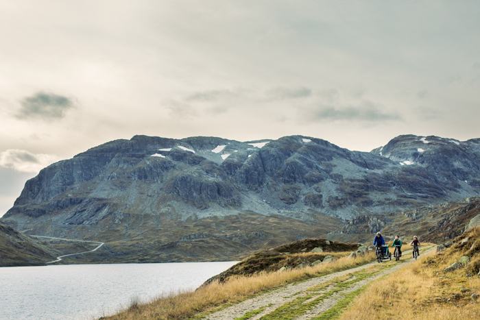
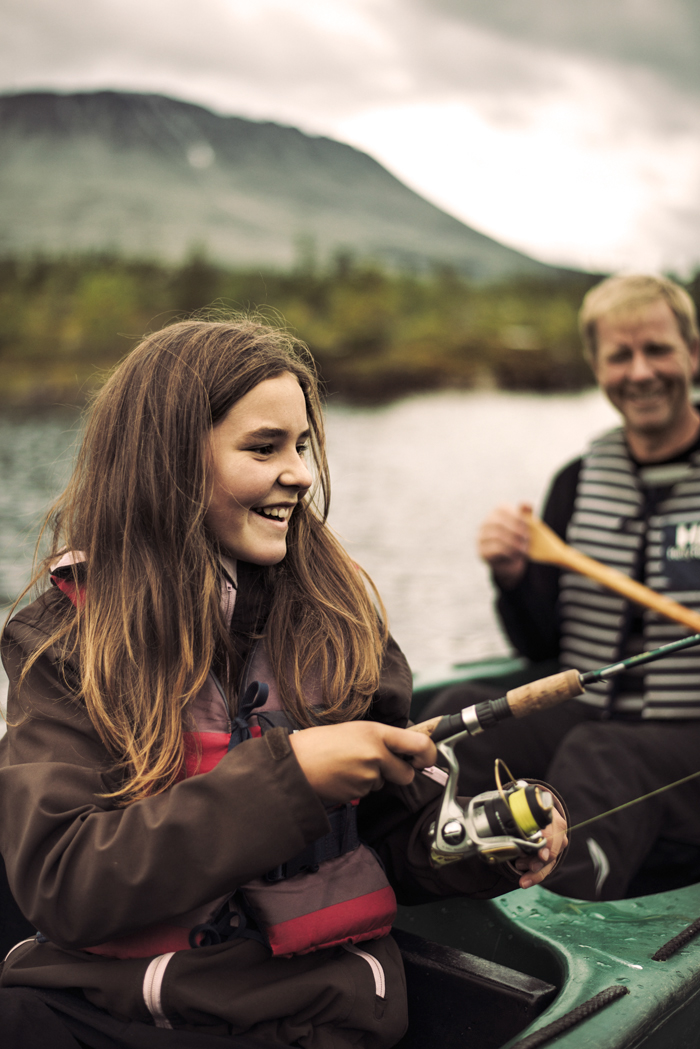
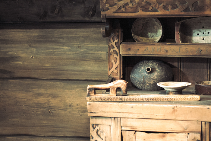
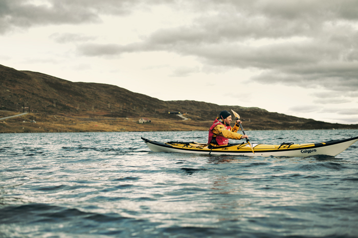
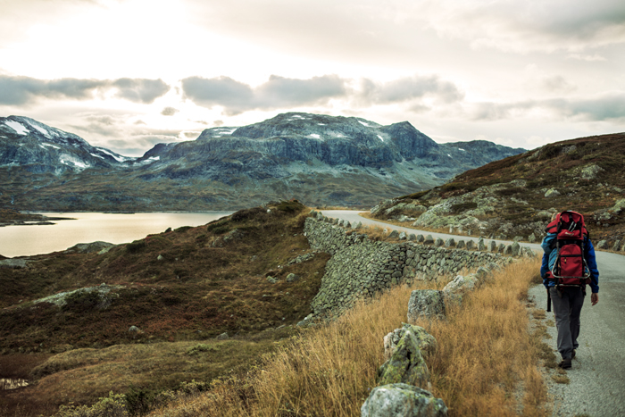
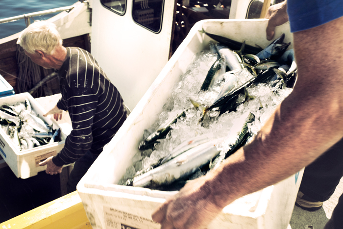
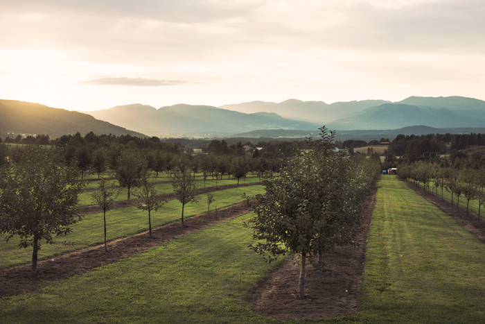
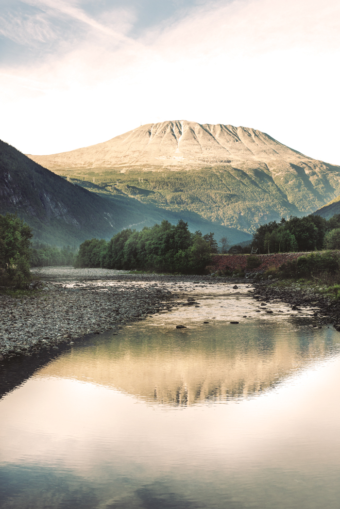
Telemark brand images presents the county's landscape, destinations, activities, adventures and details from the mountains, inland and coast
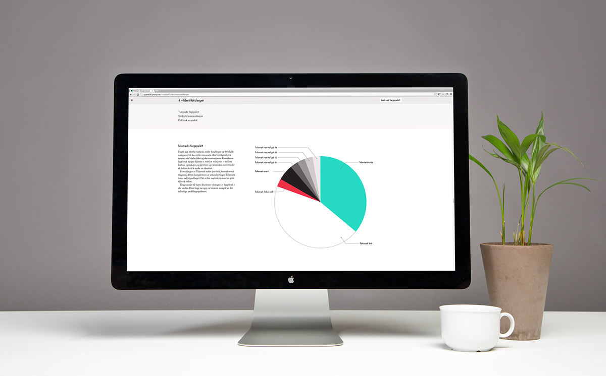
To make the new visual identity and elements easily accessible for all Telemark partners a special online profile manual was developed. On the site you can download logo, color swatches, templates, test typefaces and read the guidelines for the Telemark profile